How a new mobile website improved the user experience and increased conversion rates.
Summary
| Client: Wine.com.br | Categories: Wine, Consumer, Retail, E-commerce, B2B | Year: 2014 | |
| Duration 6 months | My Role: UX/UI design, front-end development, CSS, HTML, and JavaScript. |

Background
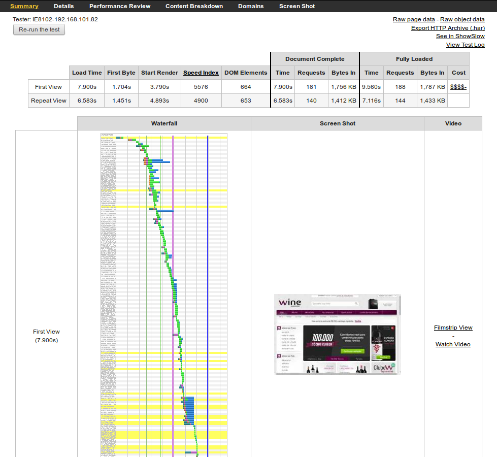
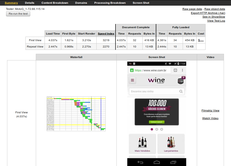
At Wine.com.br, we’d known for some time that the store’s mobile traffic had increased day after day, sitting roughly at 25% of the total traffic at the time. On the other hand the mobile e-commerce conversion rate was lagging behind of what was expected, well below the measured for customers coming from desktop or tablets.
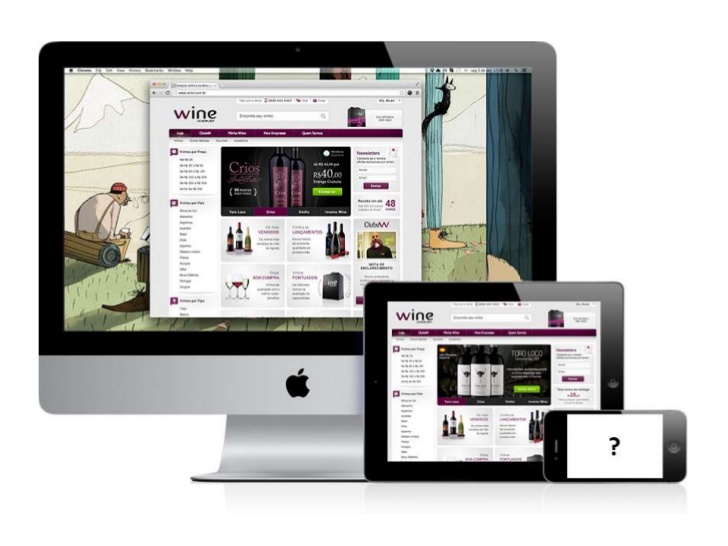
Admittedly, our mobile shopping experience was broken. I mean, it suffered big performance and usability issues because of our desktop website which didn’t support responsive layouts which required the user to pan and zoom to navigate whilst we had to support old browsers such as IE7/8, thus hurting page load times.
The goal was to improve customer engagement with a more thoughtful design and blazing fast loading times.
The Process
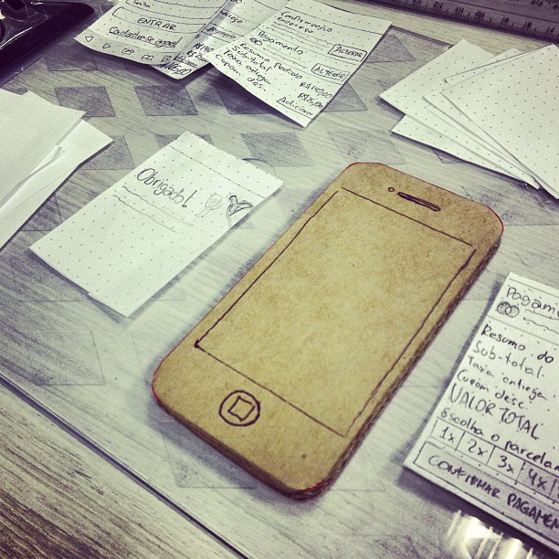
With that prospect in mind I started to sketch some pages and built a rough but useful paper prototype which helped me get sense of the device.
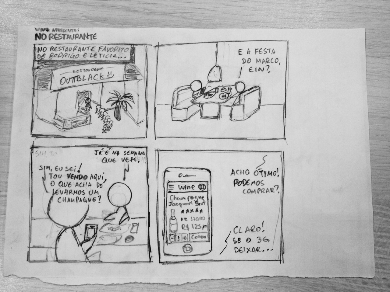
Another cool thing I made was a couple of storyboards. At first they seemed a little silly — they featured some cartoonish star-shaped human figures — but after a while I realized they were excellent on bringing light to some of the context in which the mobile website could be used.
After some consideration I moved on to Axure RP to make some diagrams and draw the wireframes with a bit more of fidelity, perhaps adding some interactivity to make things swift and understandable for both developers and managers.
I’ve already used the software a couple of times by then and though it would be a no-brainer but the reality was that Axure seemed too complicated this time. I needed something with higher fidelity but still lightweight, which would allow me to mock pages with variable content, not just “Lorem ipsum” all over the place. Gosh, I hate Lorem ipsum!
So what I finally did was to build a live prototype using HTML, CSS and a handful of PHP and JavaScript functions to jumpstart the development, cutting off unnecessary Photoshop/Fireworks layout comps altogether. I worked closely with my colleague Hideki Katsumoto to pick the right colors, fonts, sizes and spacing for all page elements.
The project was well received by the stakeholders and was given the green light. From that on, we can easily reassess the pain points in the customer’s journey, tweaking and refining when necessary.
Diving into CSS and HTML
Fortunately, we were able to push some great improvements to our front-end workflow. To begin with, we ditched the monolithic, conventional way of doing CSS with a modular, component-based, BEM-like architecture that gave us more control over our style sheets, improving overall performance and maintainability.
.OffCanvas {
  position: relative;
  width: 100%;
  overflow: hidden;
}

.OffCanvas-sidebar {
  position: absolute;
  top: 0;
  left: 0;
  visibility: hidden;
  width: 100%;
}

.OffCanvas-sidebar--primary { ... }
.OffCanvas-sidebar--secondary { ... }

.OffCanvas-content { ... }

.OffCanvas.is-menuOpened .OffCanvas-sidebar--primary,
.OffCanvas.is-cartOpened .OffCanvas-sidebar--secondary {
  visibility: visible;
}
.OffCanvas.is-menuOpened .OffCanvas-sidebar--secondary,
.OffCanvas.is-cartOpened .OffCanvas-sidebar--primary { ... }
The naming convention is heavily inspired by Nicolas Gallagher’s work with some minor additions. To glue everything together we choose LESS as our CSS preprocessor and Grunt as the task manager.
The process also included the creation of image sprites, icon fonts, touch icons, retina images and so on.
Results
The CSS work and development efforts to cut JavaScript footprint combined resulted in page load times twice as fast as the desktop version and a 25% increase in the e-commerce conversion rate over the previous months.