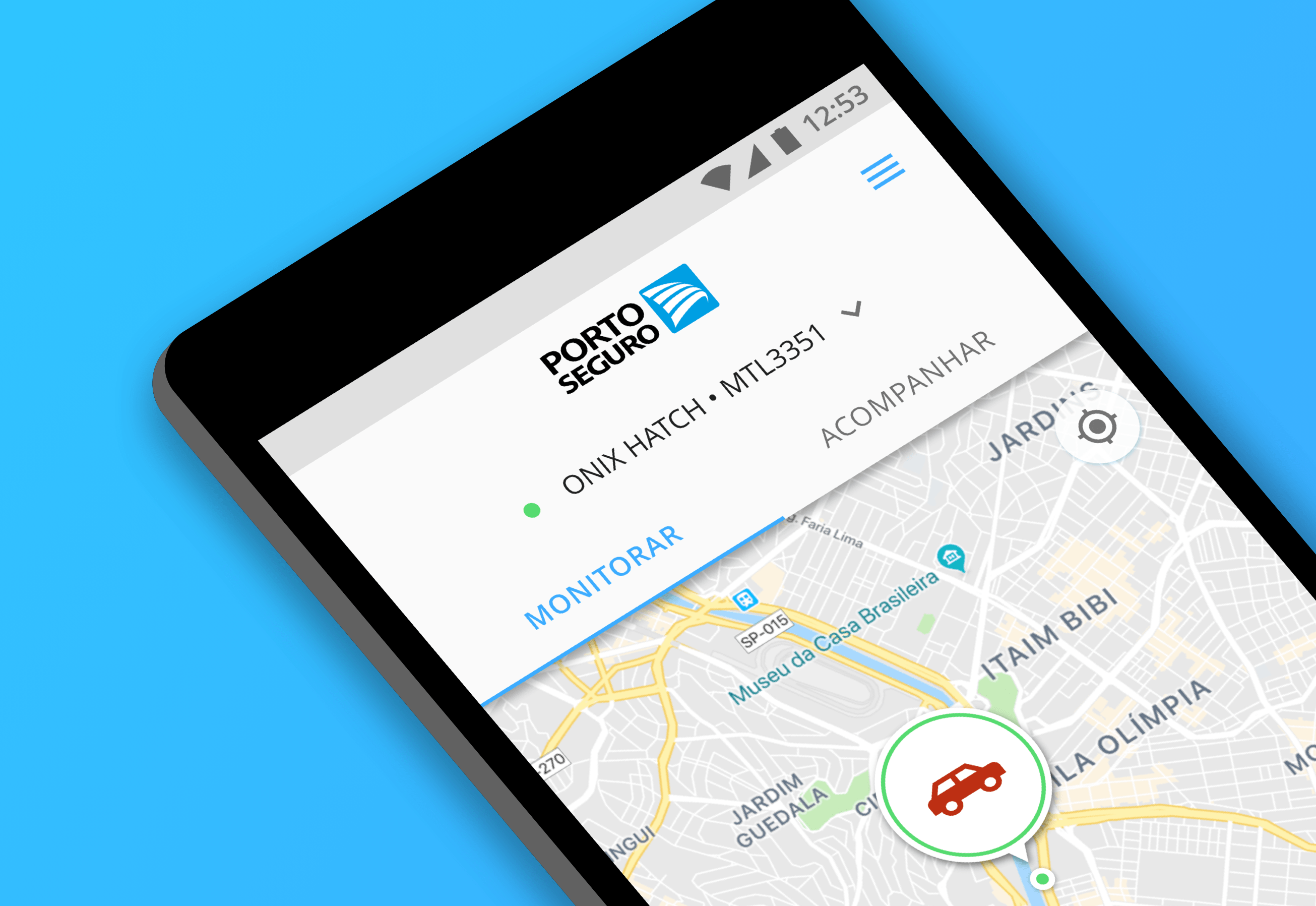
During the design and implementation of a mobile app — App do Prestador, literally Provider’s App — which was used by service providers to manage their tasks and service orders. I followed users during their work day in order to understand multiple aspects of the application, including:
- Quality and relevancy of information provided before initiating a new task.
- Accuracy of the time-tracking functionality.
- Accuracy of driving directions.
- Whether they experienced crashes or problems due to weak connection when in transit.
- Whether or not they had any difficulties using the app, like scrolling the list of assigned tasks, checking tasks’ details, viewing customer-related information and starting or finishing a given task.
- Whether or not information was easy to read in different light conditions.
- Whether and how often they needed to call the Operation office in order to resolve any issues.
Once we’d arrived at a customers’ place, I’d make some enquires based on a questionnaire I had in place which helped me understand that very often the people that welcomed the service providers were different from the people who ordered the service. By observing users in real scenarios I was able to define customer journey maps and personas.
Moving on to the next project, the Porto Seguro Faz e-commerce platform, that information was crucial when creating new landing, product, checkout pages and transactional emails so that we avoided using jargons while providing more relevant information in each step of the process.
In this project I also shadowed customer service and sales calls which, at that time, was their primary sales channel. I also reviewed customer feedback via their NPS surveys. By using this information I was able to create a number of A/B experiments, most notably:
- An experiment in which we tested different ways to display pricing information in the product page.
- An experiment in which we displayed service and warranty information graphically as a timeline in the product page.
- An experiment in which we tested the inclusion of reassuring, customer satisfaction guarantee copy during the checkout process.
A challenge we faced initially with these experiments was that the traffic wasn’t big enough to generate conclusive results, since the platform was in its early days.
Once marketing campaigns started driving sufficient traffic we were able to observe a significant improvement in sales conversion rates over the baseline version.
During this effort I was responsible for creating the designs for each variant, as well as setting up the experiments and analyzing the results on Google Optimize and Analytics tools.
At the same time, we employed tools for generating heatmaps which helped us to quickly identify sections of the web page which weren’t driving user engagement.
Finally, I was able to partner with Porto Seguro’s in-house design team on a couple of opportunities to conduct usability tests using their usability lab which featured eye-tracking equipment and an one-way mirror for observation.
Later I would use this same approach when working at the Carro Fácil — car subscription — and Proteção e Monitoramento — fleet management — apps.