-
Porto Seguro Faz
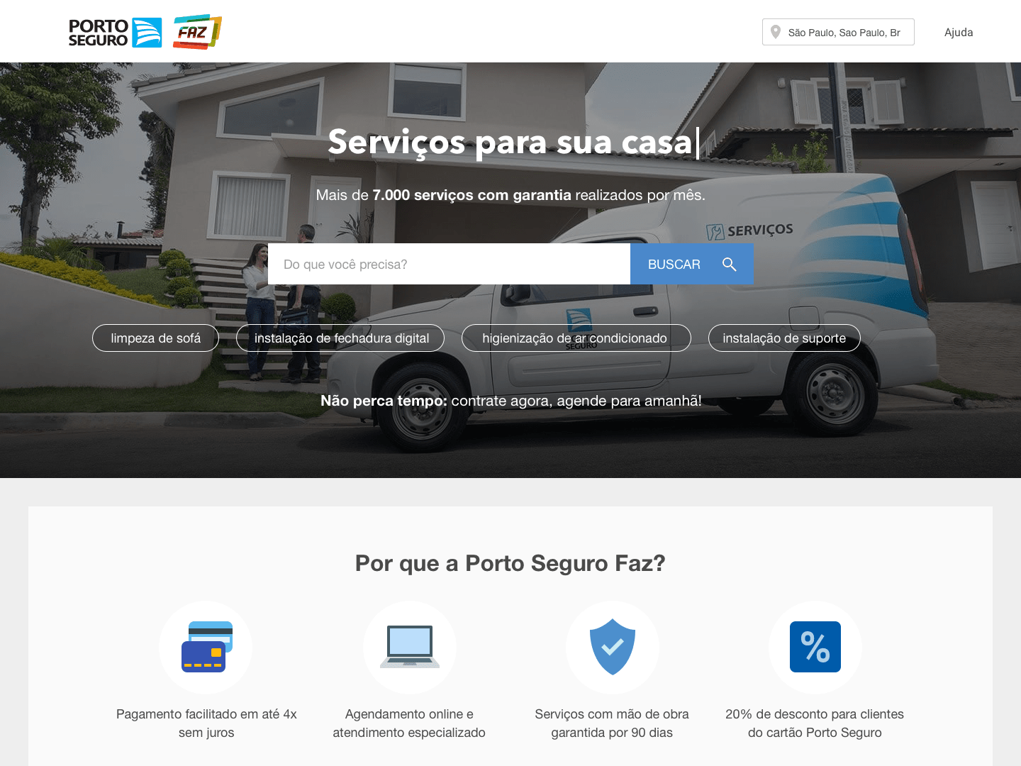
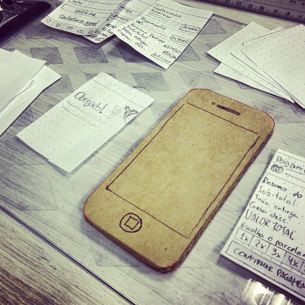
One of the most important projects I was involved with at Porto Seguro Faz was the redesign of their e-commerce website. Unfortunately some of the early sketches and wireframes are missing, hopefully, I will update this post with new material soon. The goal of the redesign was to give costumers sufficient information about the offered…
-
Wine.com.br Mobile
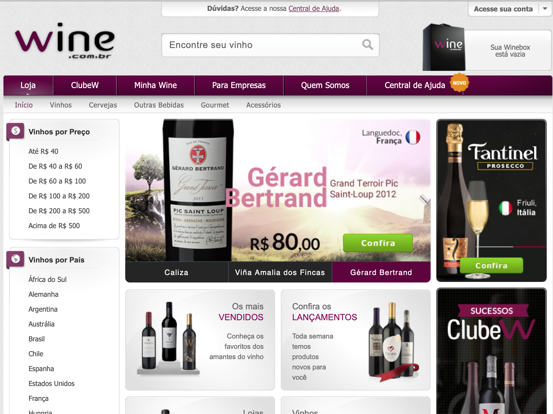
How a new mobile website improved the user experience and increased conversion rates. Summary Client:Wine.com.br Categories:Wine, Consumer, Retail, E-commerce, B2B Year:2014 Duration6 months My Role:UX/UI design, front-end development, CSS, HTML, and JavaScript. Background At Wine.com.br, we’d known for some time that the store’s mobile traffic had increased day after day, sitting roughly at 25% of the…
-
Wine.com.br
dias normais
Realising rewind is not ossible