-
Clark
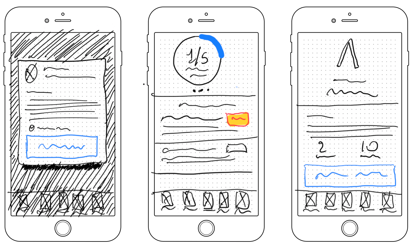
Mockups completed as part of the hiring process for the Sr. Product Designer at Clark. Bedarfscheck Insurance Details Solutions
-
Bigland Monitor

Client:Bigland Type:Web App, Software as a Service Year:2019 Contributed with information architecture and visual design for a human resources / recruiting app.
-
Carro Fácil
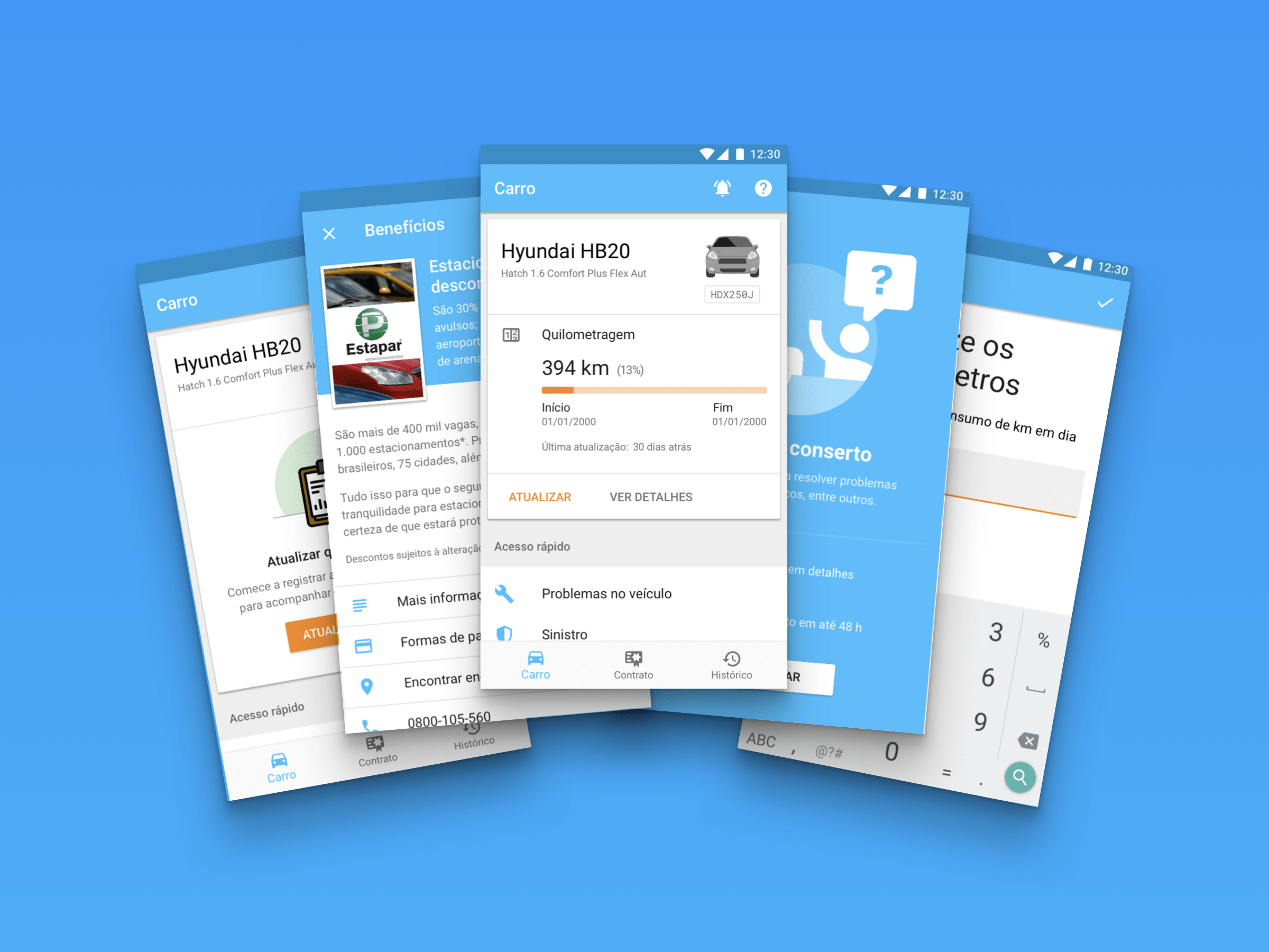
Client:Porto Seguro Type:Mobile App, Subscription Year:2018
-
Service Provider App
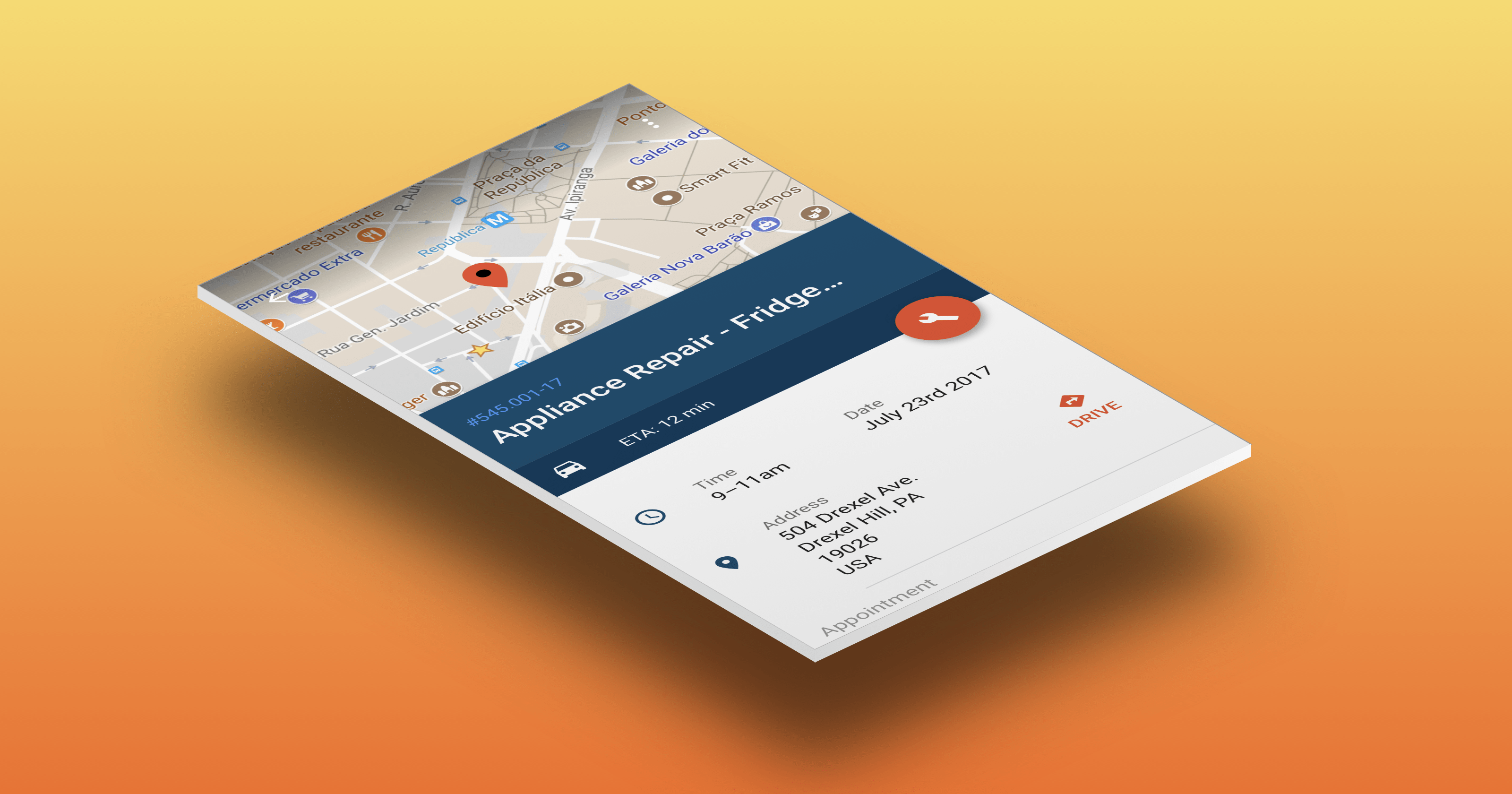
Through the past year I’ve been commissioned to create a series user interface designs for a Porto Seguro Faz’s internal apps. While most of my time was dedicated on supporting the existing features in the current app, like fixing some quirks and tweaking the flow to improve the user experience, I did find some time…
-
Porto Seguro Faz
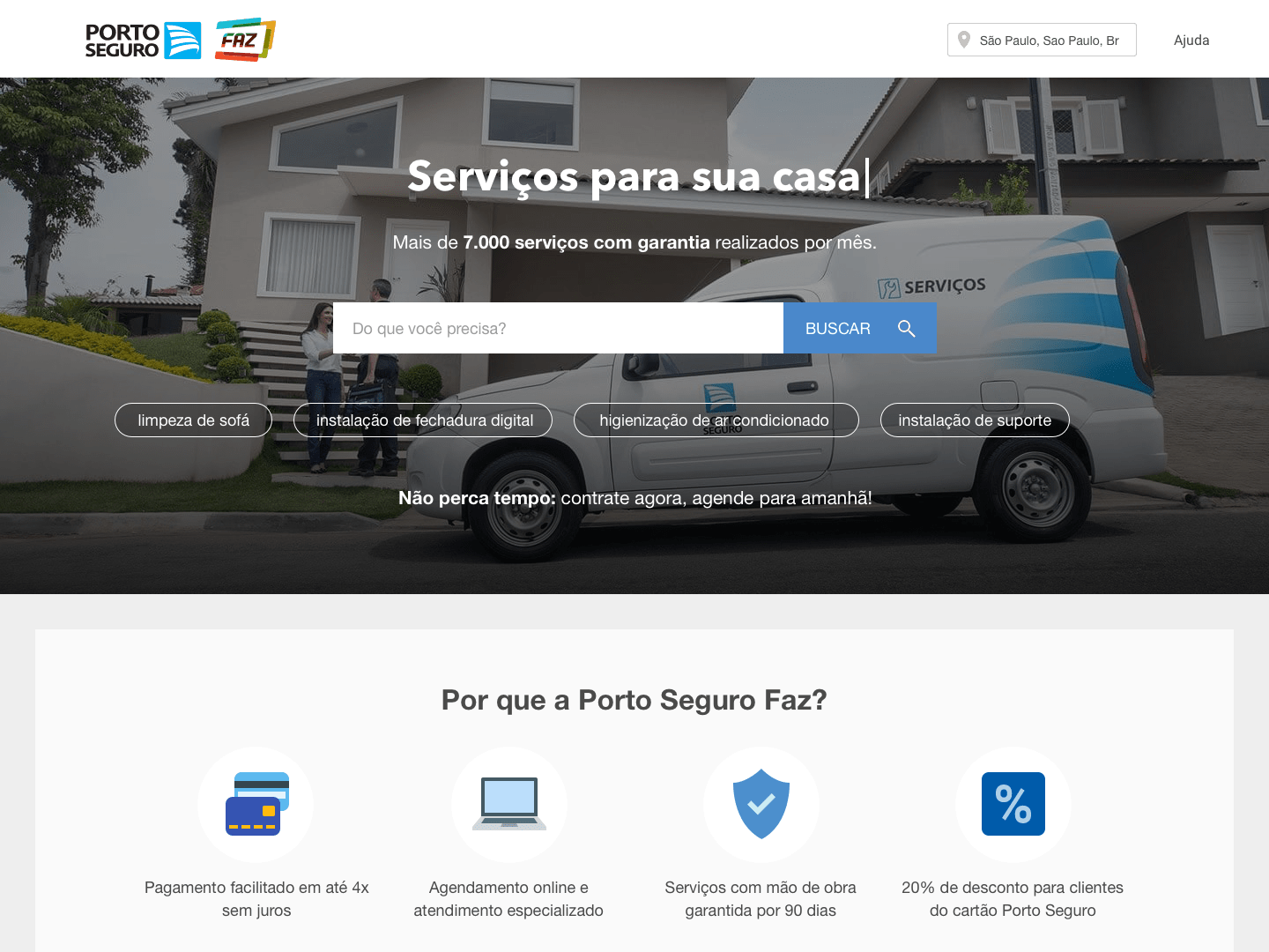
One of the most important projects I was involved with at Porto Seguro Faz was the redesign of their e-commerce website. Unfortunately some of the early sketches and wireframes are missing, hopefully, I will update this post with new material soon. The goal of the redesign was to give costumers sufficient information about the offered…
-
Wine.com.br Mobile
How a new mobile website improved the user experience and increased conversion rates. Summary Client:Wine.com.br Categories:Wine, Consumer, Retail, E-commerce, B2B Year:2014 Duration6 months My Role:UX/UI design, front-end development, CSS, HTML, and JavaScript. Background At Wine.com.br, we’d known for some time that the store’s mobile traffic had increased day after day, sitting roughly at 25% of the…
-
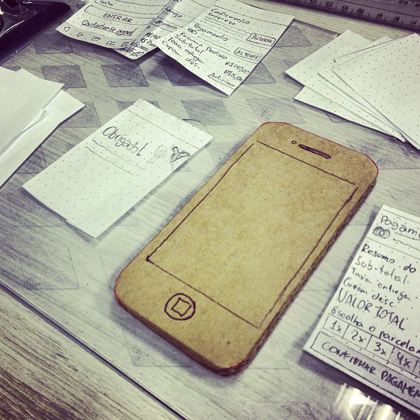
Trajetos+
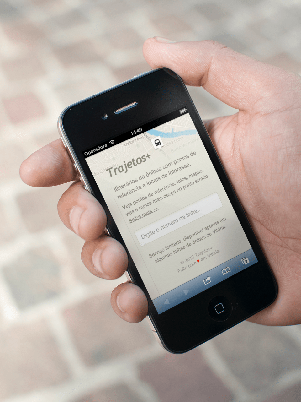
Using public transportation in a city new to you? With Trajetos you get off the bus at the right spot whilst learning about surrounding places of interest.
-
Localizador de Amigos
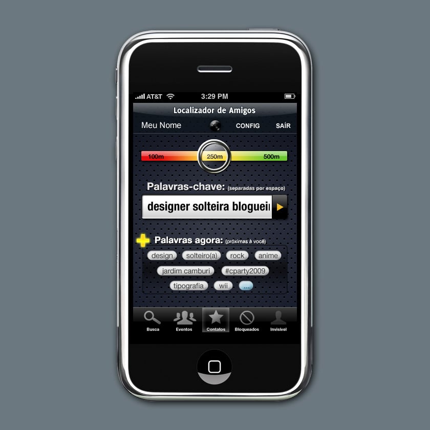
Friend Compass, or Localizador de Amigos in Portuguese, helps you to meet new people interested in the same things you are. It tracks your location and shows a list of tags you can use to filter people nearby. This project was part of the Multimídia II class, during my Industrial Design undergraduate course and it’s worth noting that this…
dias normais
Realising rewind is not ossible