How we set to create a new, mobile-first experience for an existing product while having the entire team involved through the design process.
Summary
| Client: Porto Seguro | Sector: Consumer, Car Insurance, Vehicle Monitoring, Services | Year: 2018 |
| Duration: 3 weeks | Roles: Design Sprint Facilitation, Information Architecture, UI Design |
Briefing
When Porto Seguro’s Protection and Monitoring product team approached us to design their new mobile app, they didn’t have a clear idea of what the process would look like.
The team and I had just recently been through a few hurdles — caused by constant scope changes, requirement misalignments, lack of product vision —, and we were committed to not let that happen again.
We proposed doing a design sprint workshop, an inception-like process that would include developers, designers, and product managers, bringing the experts’ knowledge, and leveraging a lean approach to design to understand the product requirements and create a well-rounded concept from the best ideas.
Our goal was to work for 2 weeks to create a working prototype that provided most of the features found in the existing desktop website and then hand it off to the engineering team for further development. Though, eventually, I’d realize there was much more work than I planned in the beginning.
Leading a Design Sprint Workshop
Before this project, I’ve had some exposure to the design sprint methodology as preached by the Google Ventures team, either by reading articles, books, or taking part in workshops.
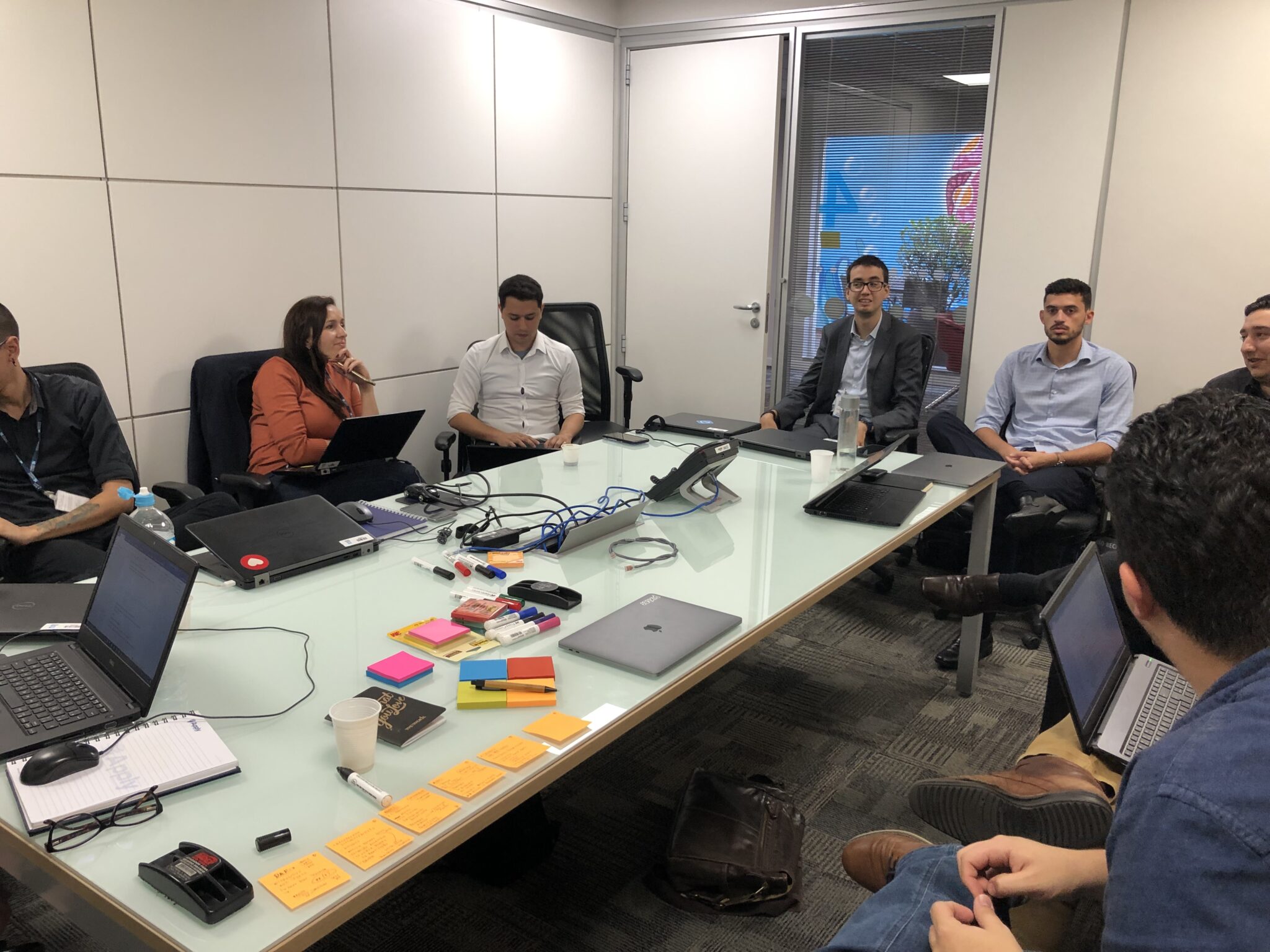
The workshop facilitation role I figured out on the fly, I guess, thanks to my previous talking, and event organization experiences. The workshop structure, on the other hand, was very much an adaption of the original methodology, taking into account our needs and priorities.
The week was roughly divided like this:
- Monday: understanding the product, customer journey mapping
- Tuesday: brainstorming, sketching out ideas, voting
- Wednesday: picking the best proposals, defining use case scenarios
- Thursday: creating an interactive prototype, preparation for tests
- Friday: testing with users, surveys, end-result presentation
Mapping the Customer Journey
Early on the design sprint, we knew that the existing web application — which was available only on the desktop — had some major limitations and inconsistencies in the perceived usability.
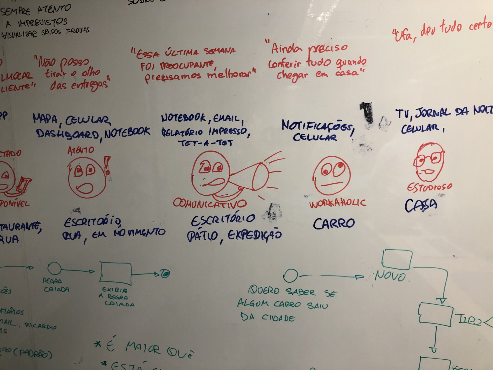
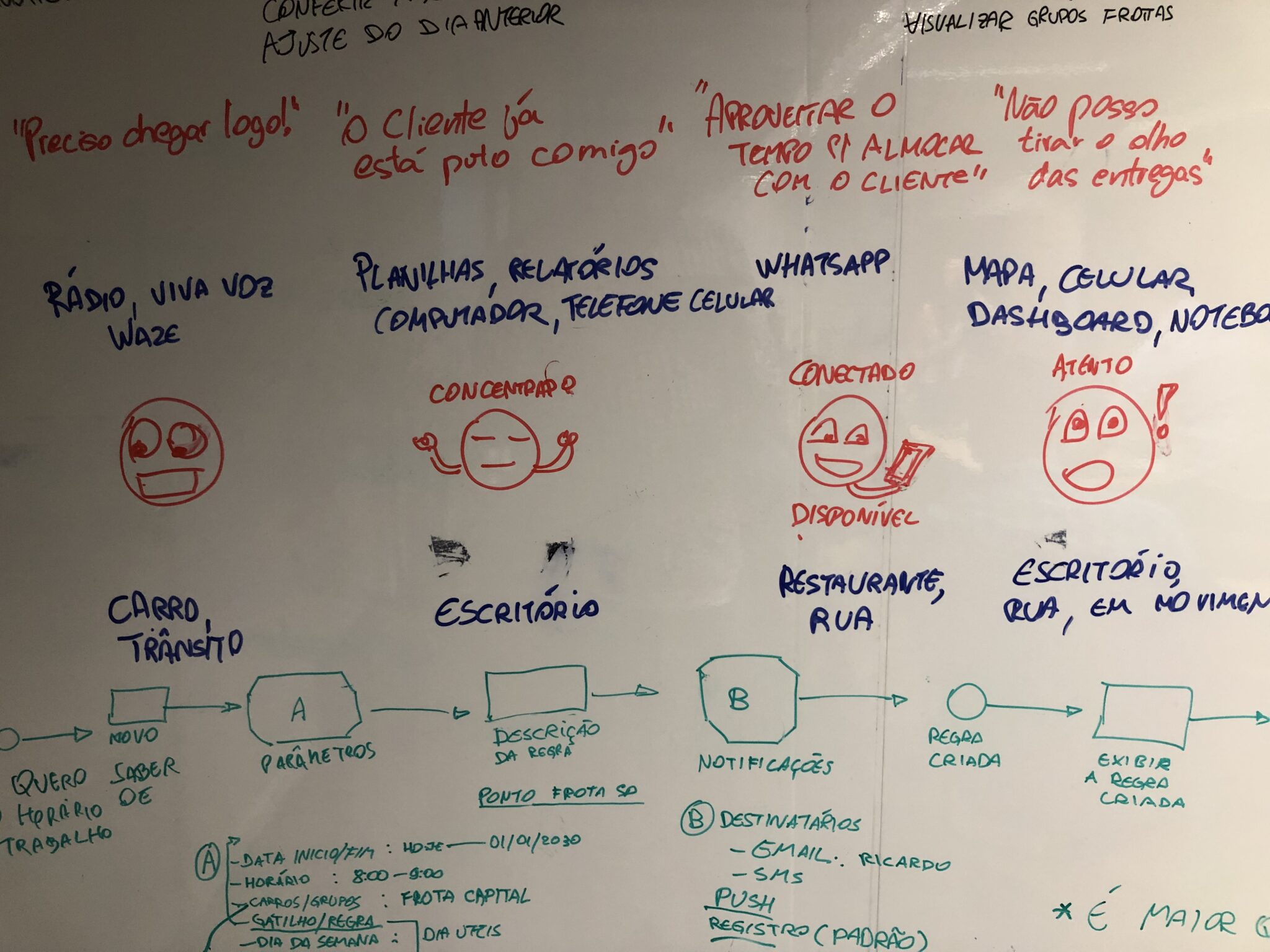
There’re several features, each aimed towards a specific user group, with different needs and expectations. In fact, some of them didn’t even work as intended. So, the best thing to do was to try and narrow down the product to its core features.
I walked the team through the customer journey for a typical use case scenario and, together, we explored the context, thoughts, feelings, and tools used by the user at each step.
Takeaways
We identified two distinct users-scenarios:
- single-use customer: owns the car, shares it with a partner, safety comes first.
- fleet or car rental manager: doesn’t own the vehicles; needs daily, comprehensive usage reports; financial costs are the priority.
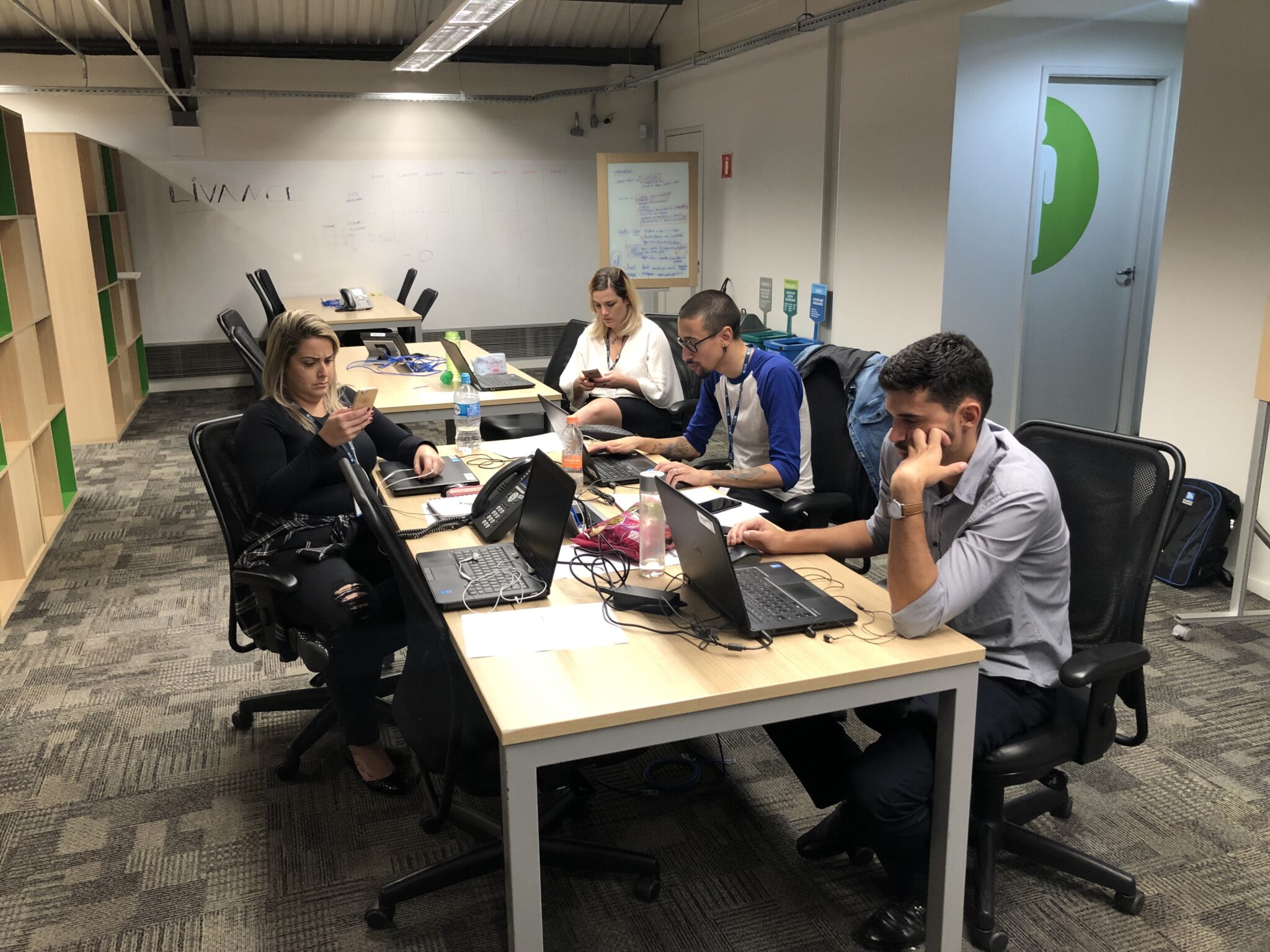
Collective Brainstorming
It was crucial for this project that product managers, developers, the marketing department felt included and with a shared sense of ownership, from the very beginning and extending to the visual design of the application itself.
Naturally, that also fits well with the design sprint we had in mind. I briefly introduced the activity to everyone, touched on the proposed scenario, and also gave some tips on how to draw wireframes quickly. No hard rules, and made sure everyone was having fun.
Finally, after an exciting, electric brainstorming session, our table was full of sketches with many interesting, wild ideas.
Each team member had the opportunity to explain and elaborate on their sketches to the group and one thing we noticed was the convergence of ideas around the right UI pattern to use in the main navigation.
Some of the UI patterns we considered for the app: bottom navigation bar, navigation drawer, bottom sheet, floating action button (FAB), tabs, and hub. We tallied our votes, discussed and weighed in the options; there was a certain consensus on the bottom sheet UI over the other navigation patterns. In reality, though, things would get more complicated in the second week, but more on that later.
Platform Consistency vs. Brand Uniformity
Once we’ve decided on a direction and which features to include, I started working on the digital wireframes. I used a toned-down, ready-made UI Toolkit for Sketch to quickly put these screens together in an effort to get something ready for testing.
Early wireframes showing different parts of the app. Most of my design decisions and overall information architecture approach was based on Google’s Material Design documentation, articles, screenshots, and reference material from some of the best Android apps out there.
Still, product marketing wasn’t happy seeing a new app that didn’t mimic the UI of the other corporate apps or adhere to the branding guidelines in place.
The main issue here was the drawer and sheet navigation pattern we’re using and which wasn’t present in any of the other company apps. So, I had to scrap this idea and opt-in for a hub navigation pattern which was more common.
Lessons Learned
While I didn’t expect that choosing the appropriate navigation pattern would raise so many polarizing opinions it was important to listen carefully to what others have to say and look for the existing guidelines, apps, and whatnot, before committing to an essential design decision, such as navigation.
Expanding the Prototype
There was no time to waste, and while things were still being settled, I pushed into further detailing and improving the initial wireframes.
I moved on to a higher fidelity mockup model and created the base color palette, typography, component, and icon library that would be used across the project.
I also took the time to define some alternative navigation paths for the new screens and screen states, to keep the navigation consistent across the different parts of the app.
Results
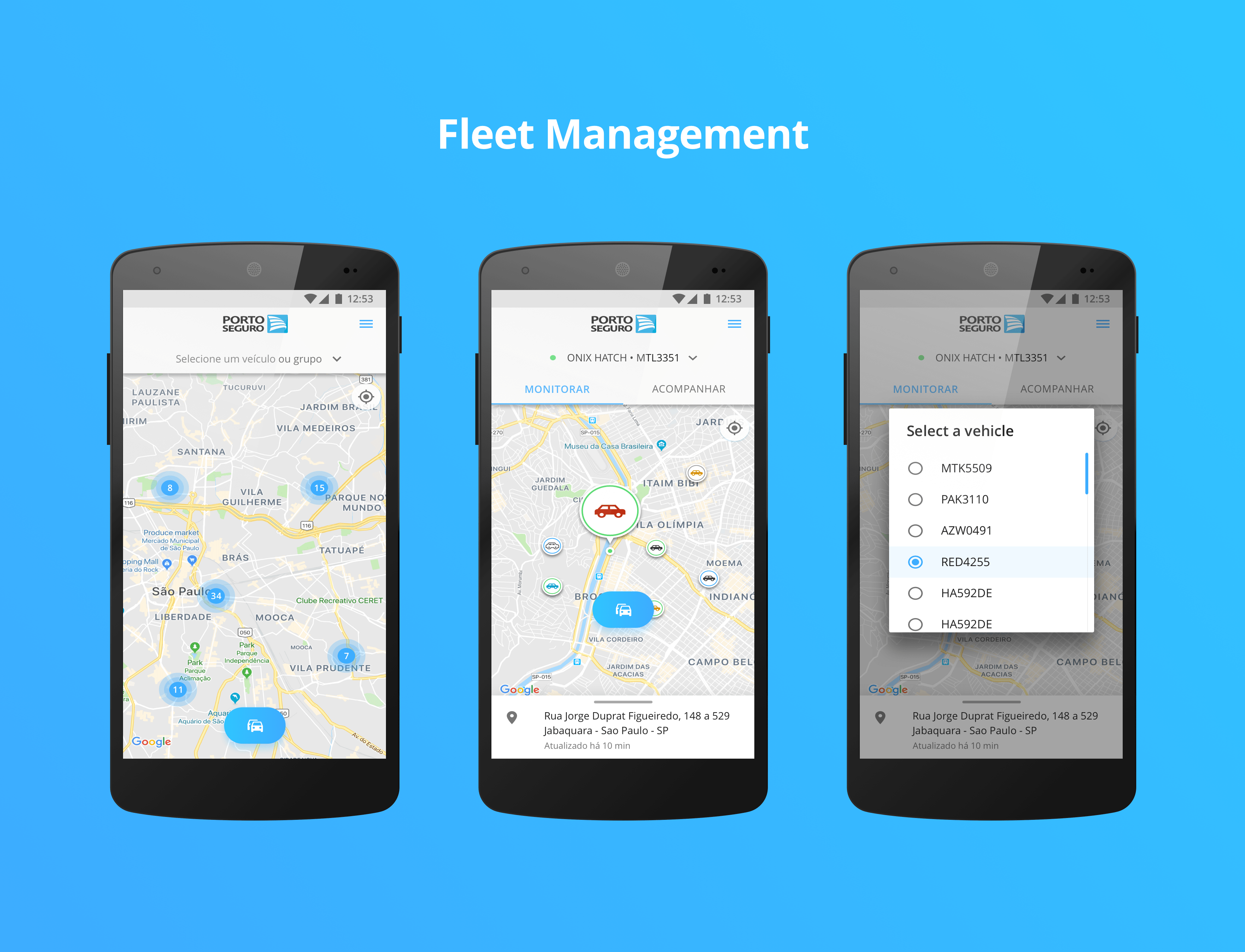
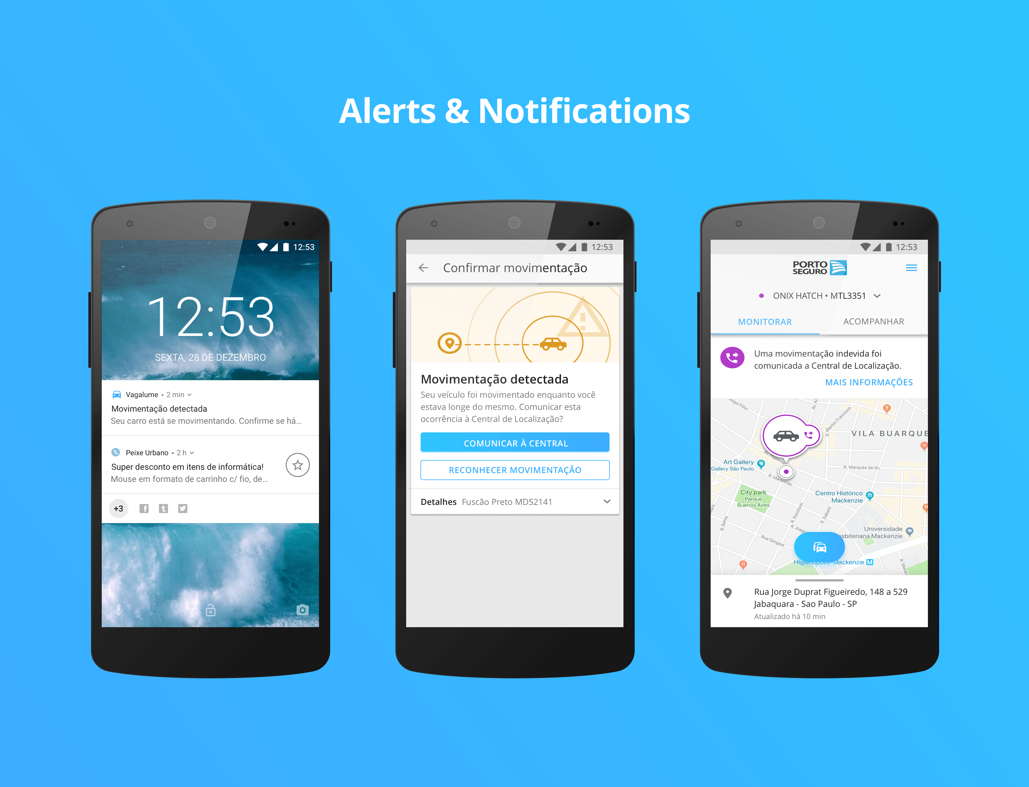

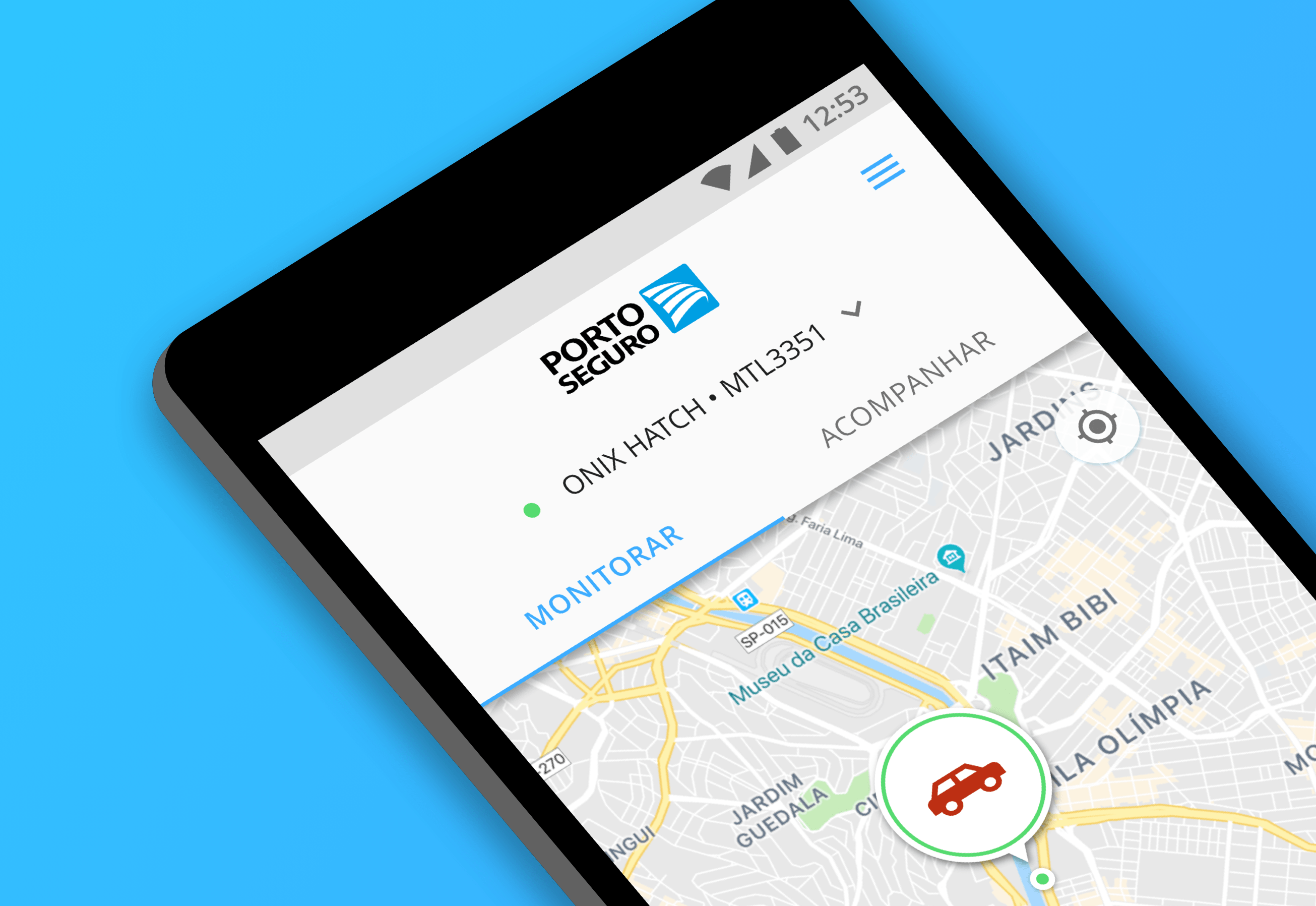
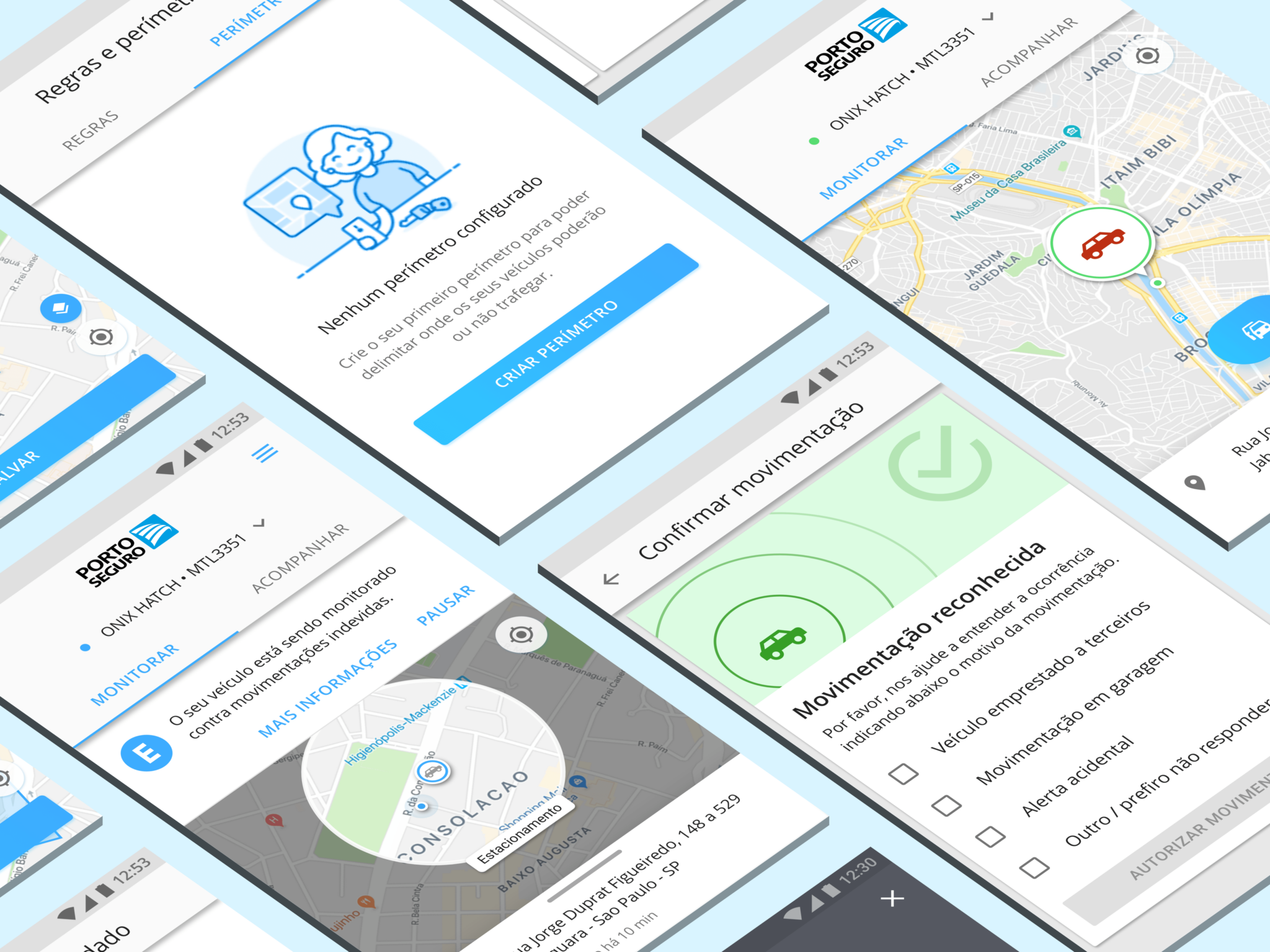
One of the most fun and challenging parts of the project was designing the map screen, from which the customer could check the current status of their vehicle or any of the vehicles they were managing.
From there, they also had access to a hub-style menu with which they could create notification alerts, set usage rules, edit their personal and payment information, and more.
Motion and Interaction
….
Wrapping Up
After two intense weeks working in different parts of the app, there was still a lot do, in terms of feature completion, that wasn’t planned in the beginning but which needed to be addressed somehow.
The client agreed to extend the project for a couple more weeks and then I was able to further design the remaining screens.
The next week I worked onsite with the client, asking questions and ironing out any issues I encountered. The result was a near-complete app prototype in InVision, which was ready to be handed off to the engineering team for development.
In retrospective, I am really proud of the work I did for this project, especially the part I was responsible for facilitating the workshop.