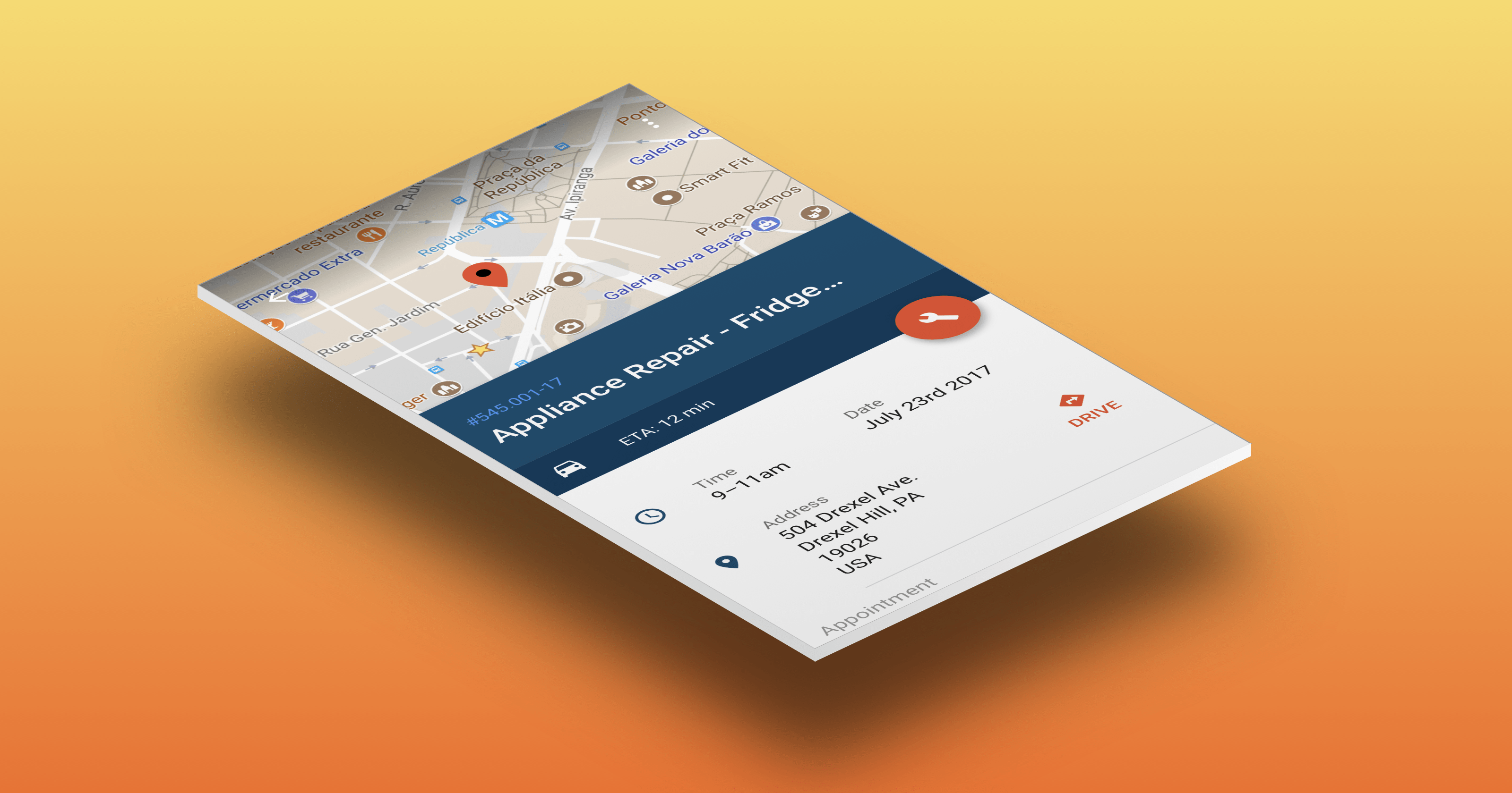
Through the past year I’ve been commissioned to create a series user interface designs for a Porto Seguro Faz’s internal apps.
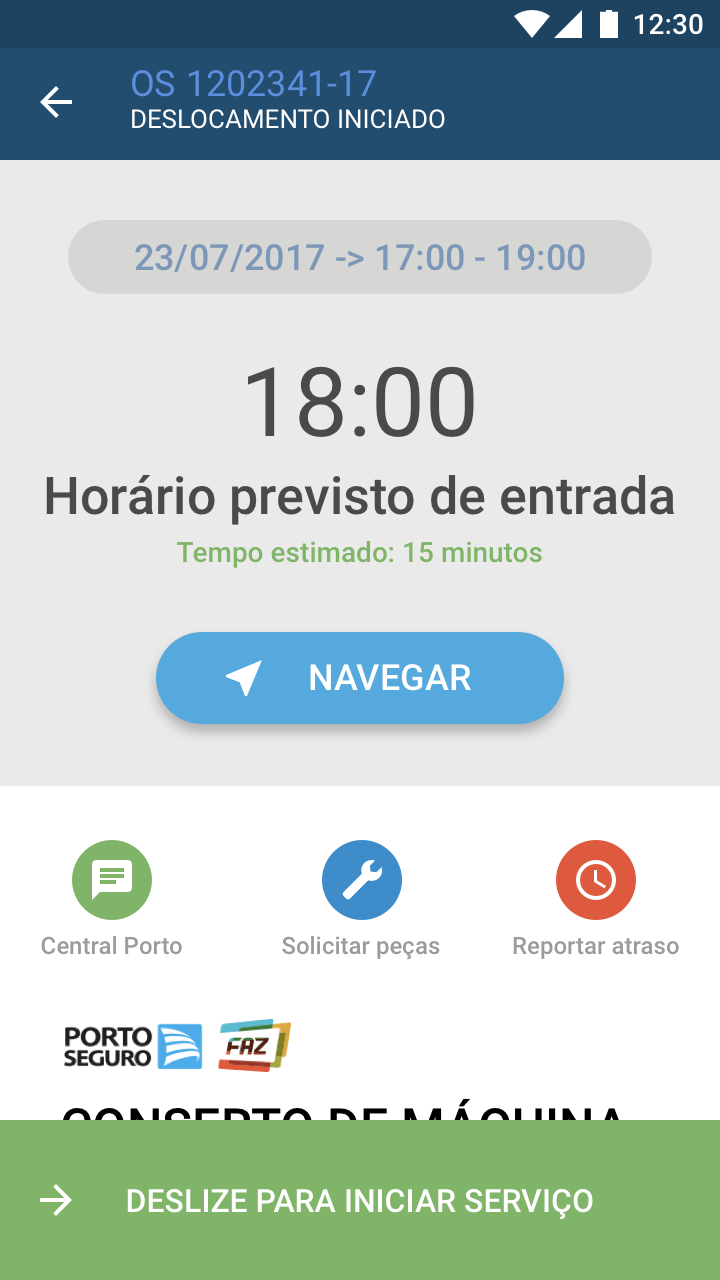
While most of my time was dedicated on supporting the existing features in the current app, like fixing some quirks and tweaking the flow to improve the user experience, I did find some time to rethink the entire interface. That’s because the existing one didn’t follow most, if any, of the Material Design principles.


I’d spent a couple dozen hours browsing the documentation, reading the guidelines, testing and experimenting with the available UI libraries. I swi! through many apps on the Play Store, downloaded dozens for reference and created many more mockups.
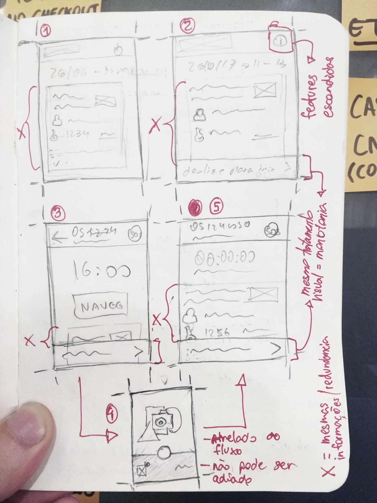
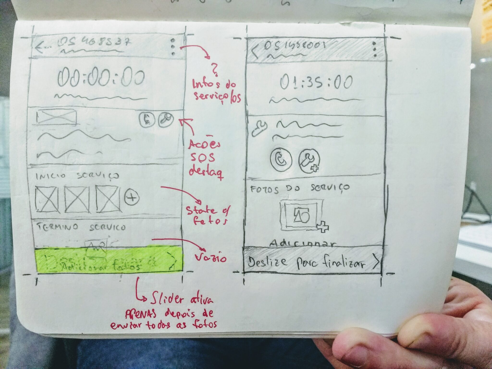
Anyways, my first challenge probably coming up with these new designs was to refine the user experience without adding new current features or displaying information that wasn’t already available.
Web App
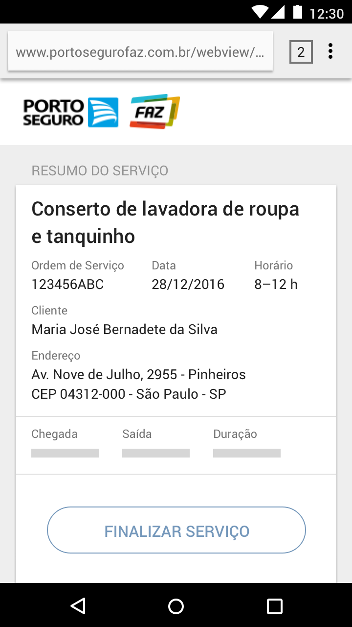

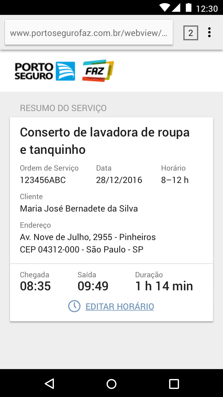
While analyzing the existing screens and designing the new ones I was constantly confronted with the Material way of organizing stuff, prioritizing information and hiding superfluous chrome from the user, which onto itself was very interesting to do.
Material Design Principles

What’s interesting about these projects is that neither had made good use of Material Design principles even though they targeted Android devices. Designers whom I’ve talked to also seemed to ignore some of the basic stuff and even out of the apps I’ve downloaded for reference, few of them had a well designed user interface.
For example, in another project I’d worked with in 2017, this time for Prombox — a financial management product for undergraduate students – and we’d been using a Material design CSS library with dozens of components, good documentation and somewhat well- organized code. Nevertheless, we failed to build a consistent, throughly thought out experience.
Many of available components weren’t really optimized for mobile devices and primary actions not well defined that led to a degraded user experience overall. The visual result was good enough but usability wasn’t on par.
Eventually, I le! the project but I’d still pitch a redesign which featured a stripped down interface progressive disclosed information. Admittedly, a more fitting approach when designing for small screens.
For me, the best part while making these projects was dealing with the screen size restrictions which really limit what you can do on a handheld device but once you get the hang of it really make things easier and straightforward to use.
In conclusion, I’d guess that even though there has been some time since these guidelines were published by Google it seems there’s a lot yet to come in terms of applying and popularizing these principles.