-
Pixelboxx
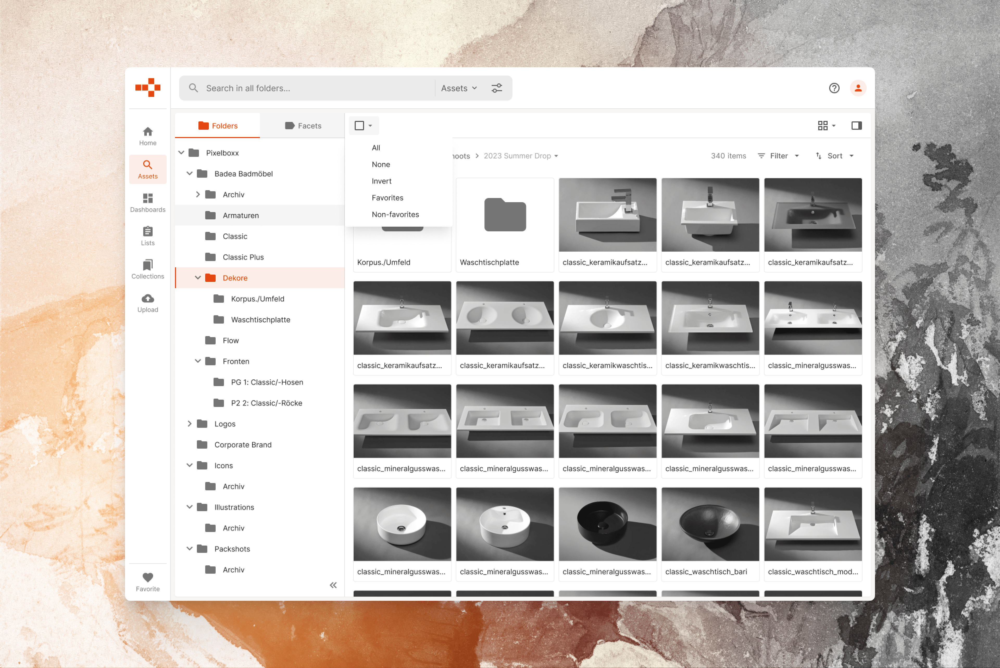
One of my first assignments was preparing a visual refresh for the Pixelboxx DAM application, which featured heavy visuals and a somewhat messy color hierarchy. Next, I started working on a proper redesign of the application, which included a modern codebase. Created mockups for new and improved product features. Customized a CSS framework used by…
-
Proteção e Monitoramento
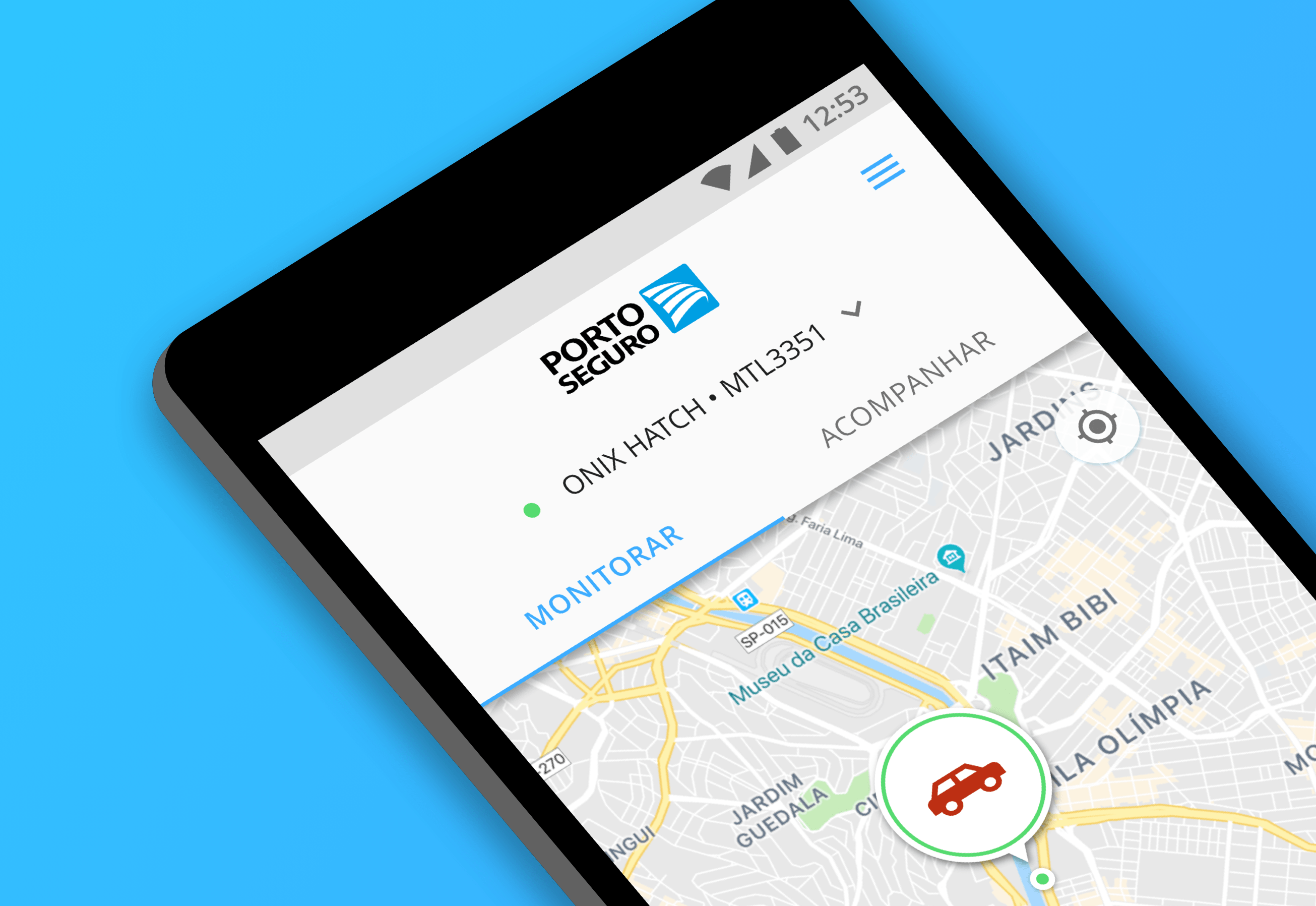
Summary Client:Porto Seguro Sector:Consumer, Car Insurance, Vehicle Monitoring, Services Year:2018 Duration:3 weeks Roles:Design Sprint Facilitation, Information Architecture, UI Design Briefing When Porto Seguro’s Protection and Monitoring product team approached us to design their new mobile app, they didn’t have a clear idea of what the process would look like. The team and I had just…
-
Wine.com.br Mobile
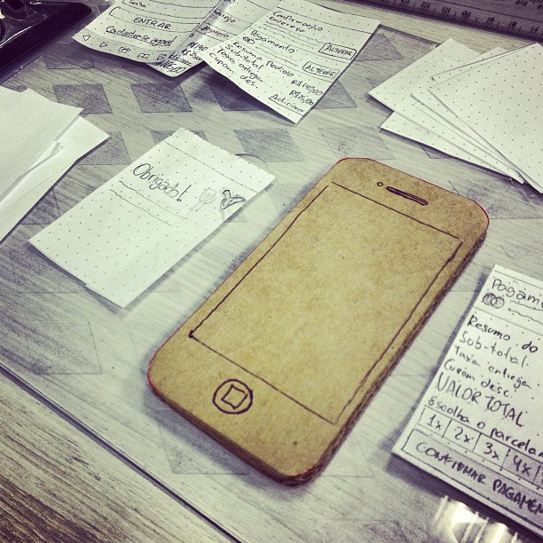
How a new mobile website improved the user experience and increased conversion rates. Summary Client:Wine.com.br Categories:Wine, Consumer, Retail, E-commerce, B2B Year:2014 Duration6 months My Role:UX/UI design, front-end development, CSS, HTML, and JavaScript. Background At Wine.com.br, we’d known for some time that the store’s mobile traffic had increased day after day, sitting roughly at 25% of the…
dias normais
Realising rewind is not ossible