One of the most important projects I was involved with at Porto Seguro Faz was the redesign of their e-commerce website. Unfortunately some of the early sketches and wireframes are missing, hopefully, I will update this post with new material soon.
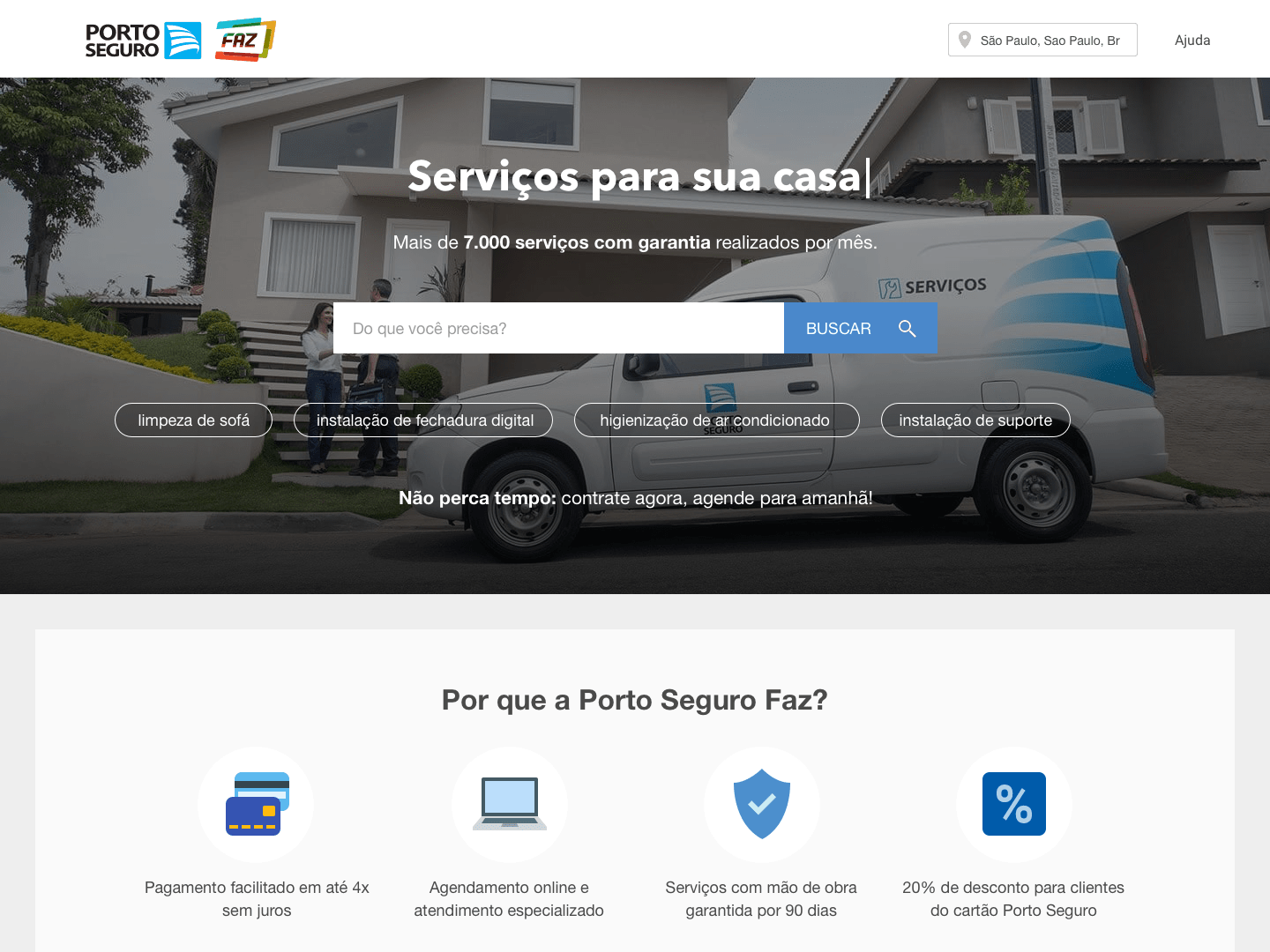
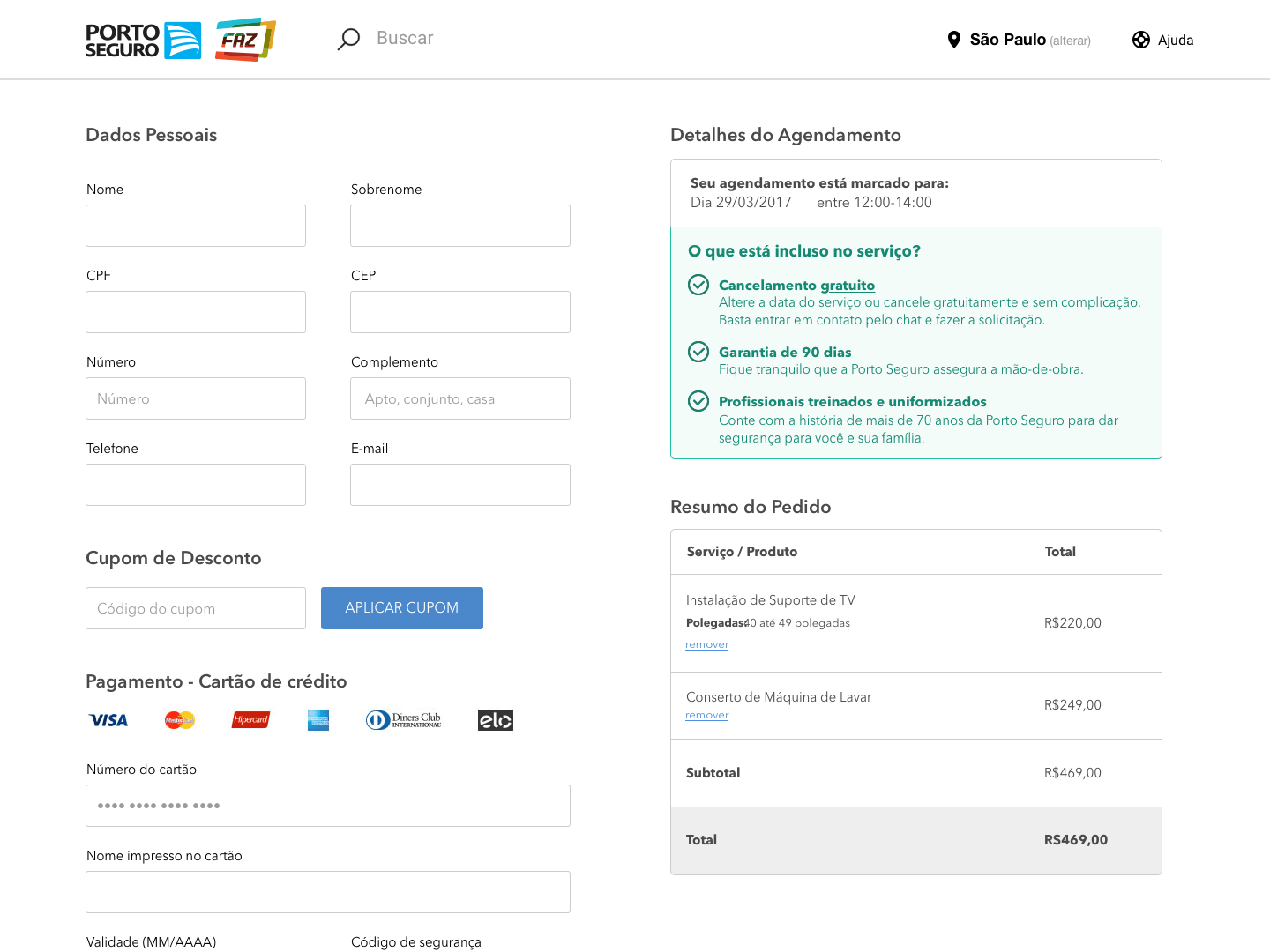
The goal of the redesign was to give costumers sufficient information about the offered services such as availability, price and any important small print leading to a correct purchase.


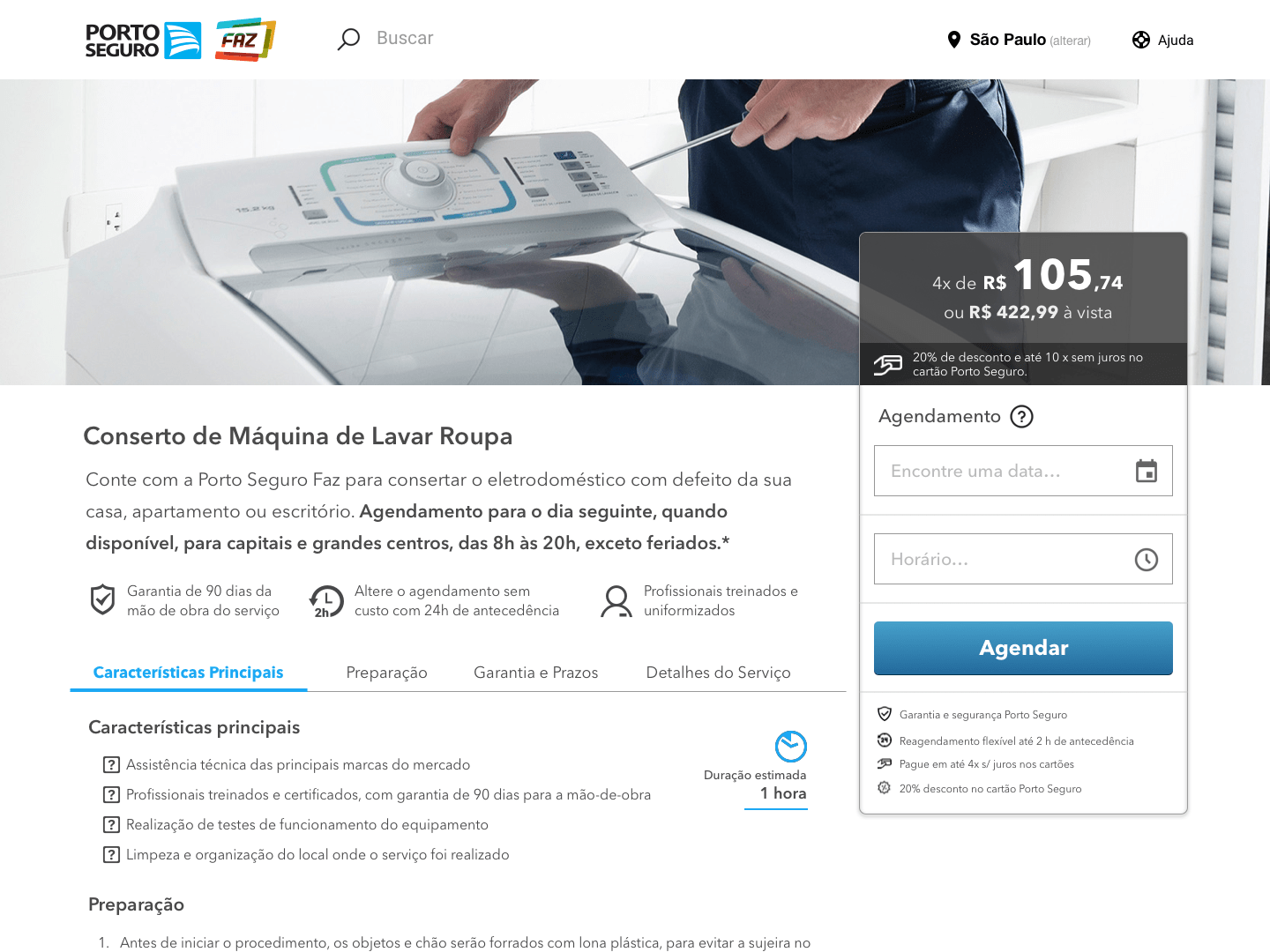
Early design proposal for the product page which featured some high-density information through the page. A brief description at the top highlighted the given service for quick reading. Content was grouped and formatted to include rich media and links for additional info
Fast-forward a couple of months, customer service interviews and research helped restructure and refine many of the content blocks of the page, moving down less important info and highlighting some of the most important ones.
Many of these changes went through a testing phase during which I setup A/B experiments to understand if the proposed changes would actually improve the product conversion rates.
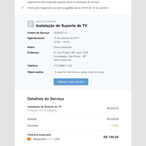
Lastly, transactional emails were updated to better reflect the new visual design language, to prevent misinformation, recurrent customer services, and unneeded inquirers.

There were a handful of ideas, proposals, and experiments that didn’t see the light of the day, though. All in all, this a really good experience, particularly when some A/B experiments didn’t turn out the way the team expected.