Author: Sarah

  • Teletext and the Early Ages of Digital Art

    Teletext and the Early Ages of Digital Art

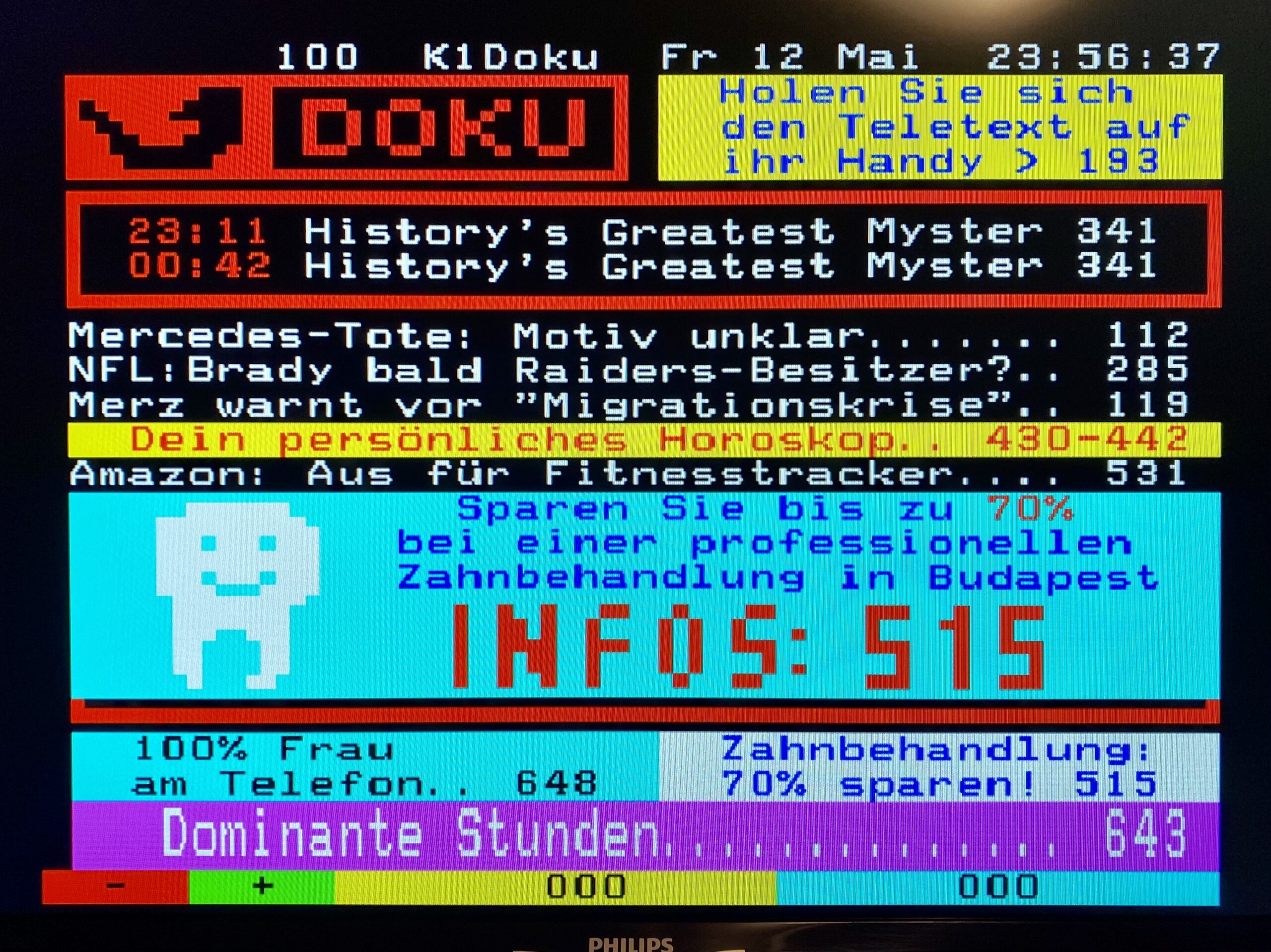
    I first heard of Teletext one day when reading about pixel and ASCII art. Teletext is a standard for displaying text and graphics on a television invented in the early 70s on the UK. It works by sending the information in the broadcast signal on an invisible area of the display which is then decoded and buffered in a series of “pages“ which can be accessed via the remote control.

    I never thought I’d ever see something like that until recently when I spotted it still working on a TV hotel in Rüdesheim am Rhein, Germany in 2023.

    A friend of mine (@werls) then pointed me to Telidon, a telecommunication system invented in Canada in the late 70s. Recent art projects are seeking to recover and preserve the digital art created during that period. Motherboard also published a cool video about its history and legacy.

    The Lost Art of Canada’s Doomed Pre-Internet Web
  • Annie, Let’s Not Wait

    Annie, Let’s Not Wait

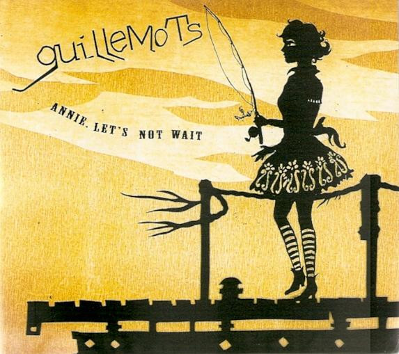
    Music video for the song Annie Let’s Not Wait by Guillemots (YouTube)
    Annie, let's not wait, let's cross the river now
    We could sit for years staring at our fears
    Oh they're such pretty things they're so cute
    But our dreams are all we really need to grow
  • Show Me Mary

    Show Me Mary

    “Show Me Mary” by Catherine Wheel (YouTube)
    Mary sticks her tongue out, it's a sign
    Two fingers is a magical state
    And she promised me she'd show me why
    I don't think I can wait
  • Surprise, surprise on the stage

    Surprise, surprise on the stage

    You know being positively surprised is one of the best feelings there is.

    The other day I went to this music venue here in Dortmund with Fernanda expecting to watch a Mastodon concert, no big deal.

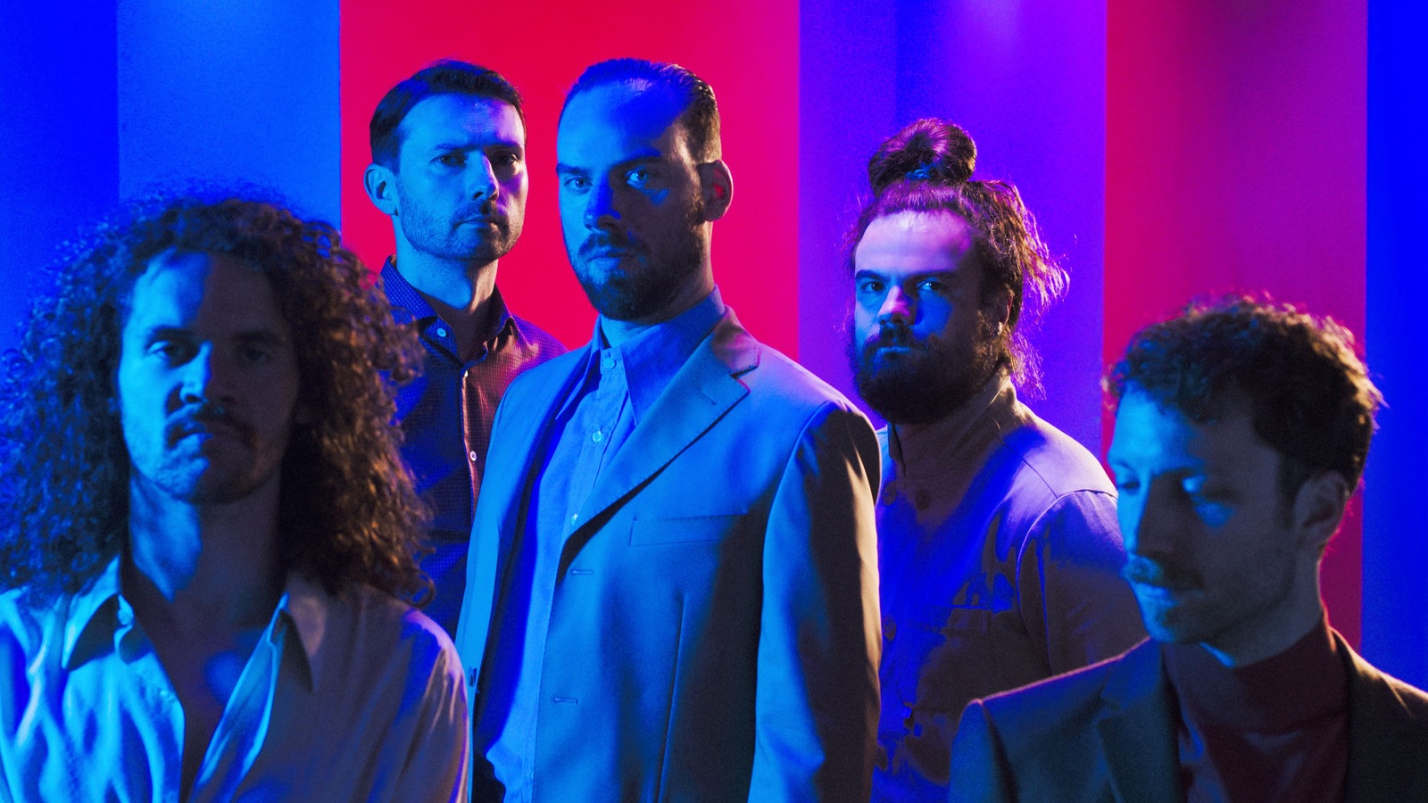
    Like, Mastodon was fucking great and all, no surprises there, but what we ALSO got was an excellent, entertaining as fuck performance by opening band De Staat.

    The bass part in particular was NUTS. Loud, heavy and groovy. It’s something that unfortunately can’t be easily reproduced on video, but I think you can get a decent feel how they are on the stage.

    Favorite tracks: Input Source Select, Pikachu.

    De Saat Live @ Rockpalast
  • The inconspicuous beauty of liquid-crystal displays

    The inconspicuous beauty of liquid-crystal displays

    The world around us is rather spectacular. It’s filled with things that may look ordinary for the naked eye but at close inspection can reveal an entirely new dimension.

    Take liquid-crystal displays, for example.

    No, not the one you’re looking at. The screen in which you’re reading this probably is a modern LCD panel made of billions of microscopic red, green and blue-coloured LEDs which are beautiful in and of themselves. I’m talking about its grand-grand-grand-grandmother, the one which shows these odd-looking, seven-segment digits.

    An old digital watch face displaying the time
    A digital watch face displaying the time.

    Like many computer technologies, LCDs were pioneered in the 60s. It got lighter and more efficient, sure, but its basic design and function didn’t change drastically through the years.

    Its simple, elegant interface’s everywhere: on digital watches, microwave ovens, cameras, audio recorders, musical instruments, elevators, calculators, gym equipment, car dashboards, cellphones — old ones, remember? — and many others.

    But one thing these old, primitive liquid-crystal displays possess it’s their peculiar optical properties. Something that’s not quite obvious to notice without a powerful macro lens and additional light sources.

    Check out this video (with headphones on) and be amazed:

    The DSM LCD (like) you’ve never seen

    If you don’t trip after this you probably have spent too much time in Amsterdam but hey, I’m not judging.

  • From screen pixels to ink on paper

    From screen pixels to ink on paper

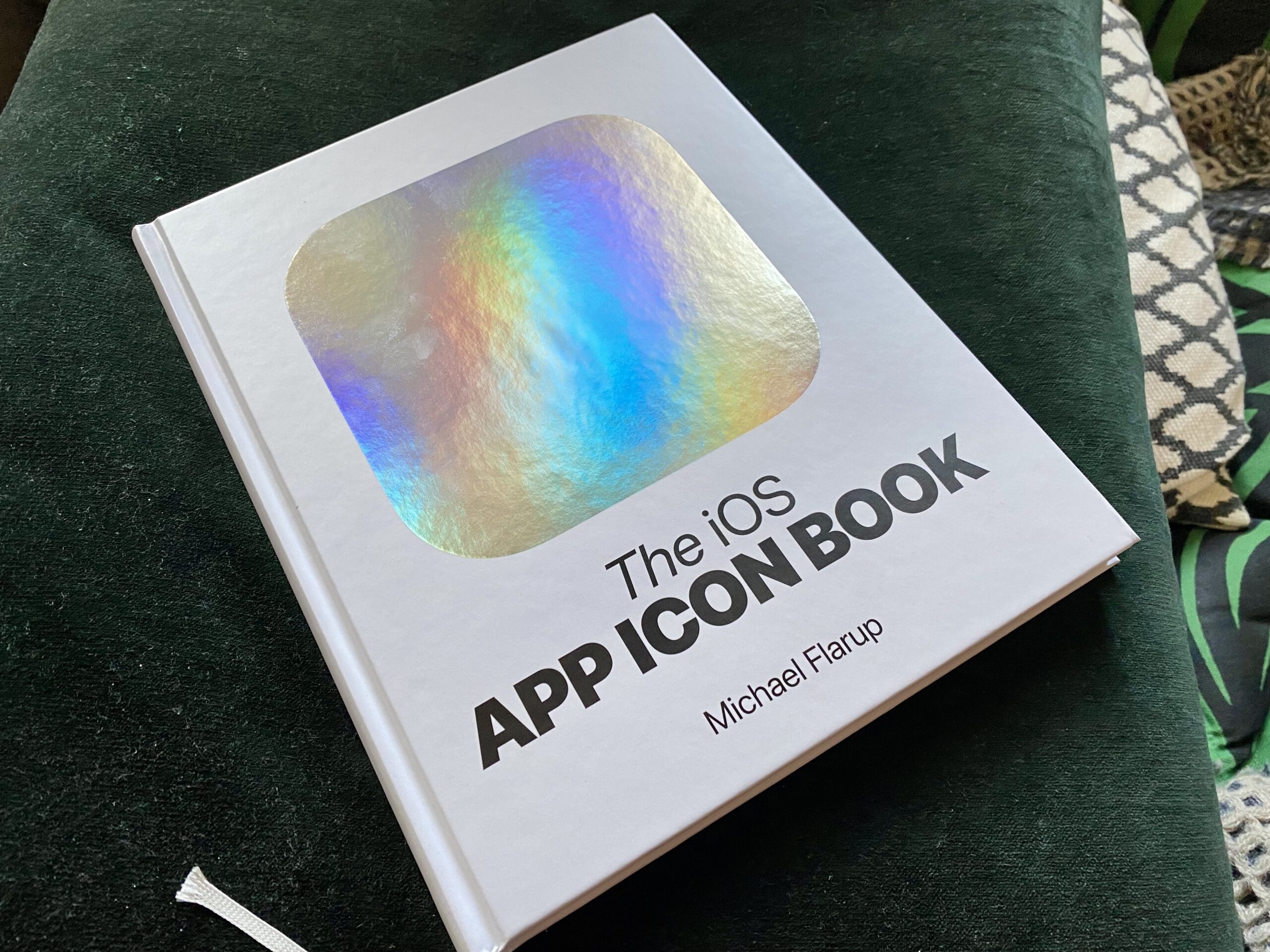
    Cover of the iOS App Icon Book. The cover features a white background with a big silver reflective rounded square shape on the center

    This beauty arrived in the mail just the other day. ✨

    The iOS App Icon Book is a project created by Michael Flarup that celebrates the art and craft of app icon design.

    The project was funded by a successful Kickstart campaign that raised over 135.000 € by 1.450 backers.

    An aside, this is actually the second Kickstarter campaign that I’ve backed, the first one being the Pebble 2 smartwatch back in 2016.

    The book is great, colours are vibrant and the printing quality absolutely superb. Containing over 150 pages and hundreds of icons, I hope this book’s gonna provide a ton of inspiration for me.

    Detail of a page of the iOS App Icon Book. A grid of icons can be seen. On the center the Chegou app icon is visible. This icon shows the classic Brazilian Correios in blue and yellow and crossed by a messenger's bag blue strap.
    Chegou app icon by Marcel Muller

    One thing that I couldn’t not notice though is that there aren’t many icons by Brazilian or Brazil-based designers in the book.

    One that I could find is the gorgeous Chegou app icon by Marcel Muller. The icon is super recognisable and clean, it depicts the classic Correios uniform in blue and yellow.

    So in order to remedy this I will create my own collection of iOS app icons by fellow Brazilians and display it on this very website in the coming weeks!

  • Beyond Tellerrand Day 1

    Beyond Tellerrand Day 1

    I know it’s a bit late in the night and I should’ve been sleeping but I really wanted to write some words about the first day of the Beyond Tellerrand conference in Düsseldorf.

    The quality and diversity of talks and presentations is excellent. But of course what makes the event really shine are the people.

    I met some interesting folks from Slovenia and the UK. We chatted over some beers, discussed about the preservation of the web, the role of communities and the infinite depth of online fanfic communities.

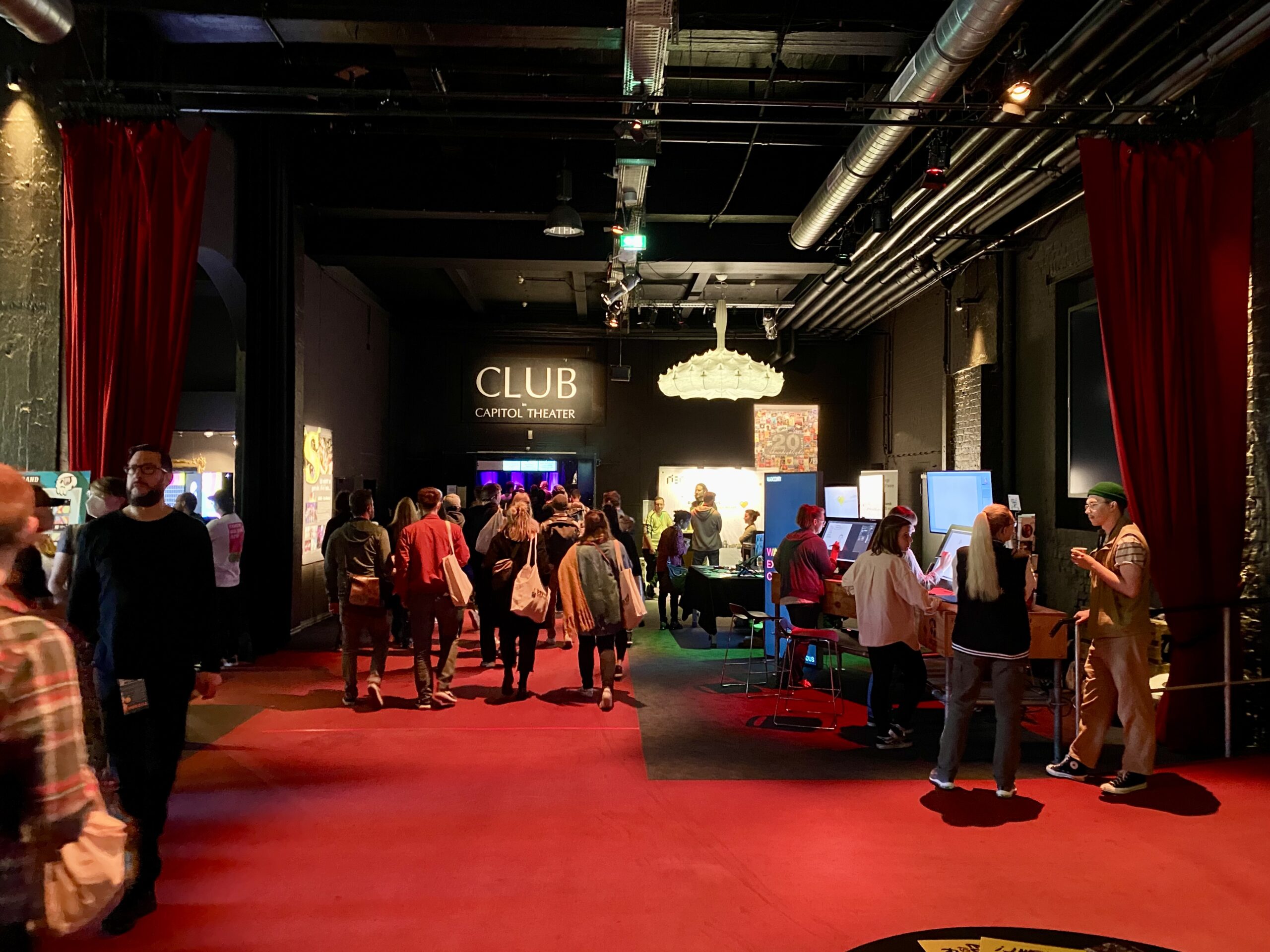
    Before that, on Sunday, I met some other people at the Wacom Experience Center. There was this super trippy room with a TV and neon lights in which I met this guy from Viena and we chatted about creativity.

    Trippy room at the Wacom Experience Center. A TV shows an astronaut floating in a sea of star and galaxies with bright colours on a loop. On the ceiling, rings of neon lights in different colours.
    Wacom’s trippy room

    I learned that some of these people also attended the IndieWebCamp which’s this kind of self-organised, user-generated event that aims to help people to publish their on websites outside of corporate walled-gardens like Twitter, Google and Facebook.

    Honestly I couldn’t feel more inspired! That’s the kind of stuff that can make me go on for hours on end.

  • MiniTimer: a minimal macOS app for setting timers

    MiniTimer: a minimal macOS app for setting timers

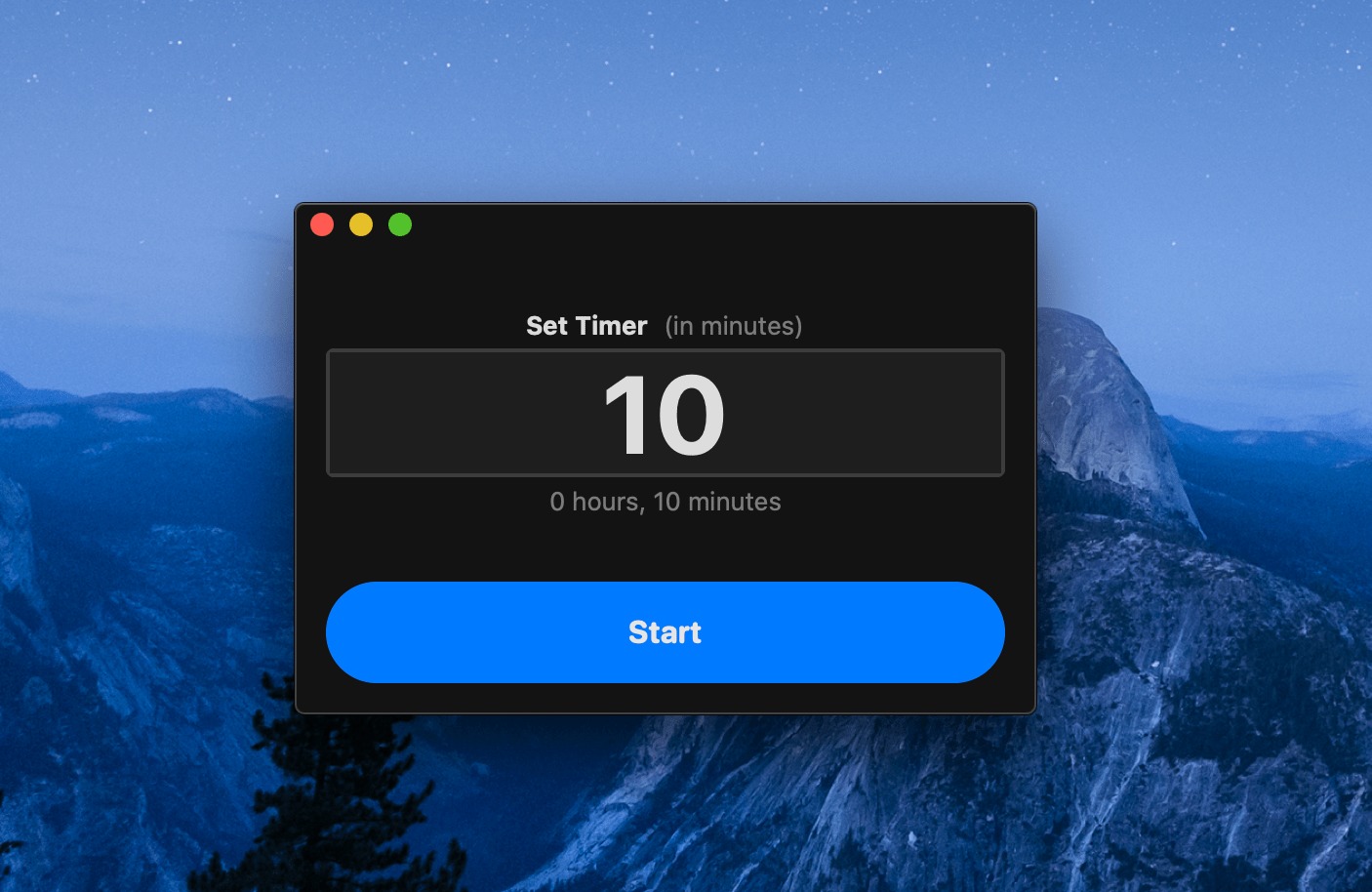
    Screenshot of the MiniTimer app displaying a 10 minute timer

    This past weekend I saw a tweet by Daniel Eden in which he created a very simple timer app using SwiftUI and Combine frameworks.

    I decided to make one for myself because I thought it would be really useful at work and also because it was a very practical way to learn some Swift programming.

    As I was at it I took the time to make a simple icon — because why not?

    The original code can be found in Daniel Eden’s Github. Thanks, Daniel!

    Download

    MiniTimer.zip (169 KB)

    Note: requires macOS Catalina or later.

  • The Stupidest Person in the Room

    From all the time that I spend consuming weird videos about vintage videogames, cooking, and programming, I am currently, particularly obsessed with Wintergatan’s channel on YouTube.

    In the Wintergatan Wednesdays’ series, Martin Molin shares his building process for the upcoming Marble Machine X, a musical instrument designed to produce tight music.

    “Being the stupidest person in the room is the best situation you can find yourself in… Because that’s where you’re learning.”

    Martin Molin
  • The Instagrammeuphoria

    The Instagrammeuphoria

    From this Vox article:

    Instagram has a way of flattening lived experiences so that my best years look exactly like my bad ones, and that everything seems pretty good, all the time, for everyone. This, obviously, is not how life works for most people, and ever since Instagram has existed experts have debated what seeing an infinite scroll of other people’s happy moments is doing to our brains.

    Then it goes on:

    […] Even when you know it isn’t real, that social media is a highlight reel of people’s lives and you shouldn’t compare yourself to anyone else, that it’s a trap and it will only make you feel bad about your life, which is overall probably a perfectly fine one, Instagram still has real, material consequences. Being good at Instagram is a ticket to more likes, more followers, more tiny hits of dopamine and ultimately more fame and money; a platform to launch a creative project and sell it, to be able to live the life we’re supposed to want.

    The whole article is worth a read.

  • Found This Gang of Lego Minifigures in Cologne

    Found This Gang of Lego Minifigures in Cologne

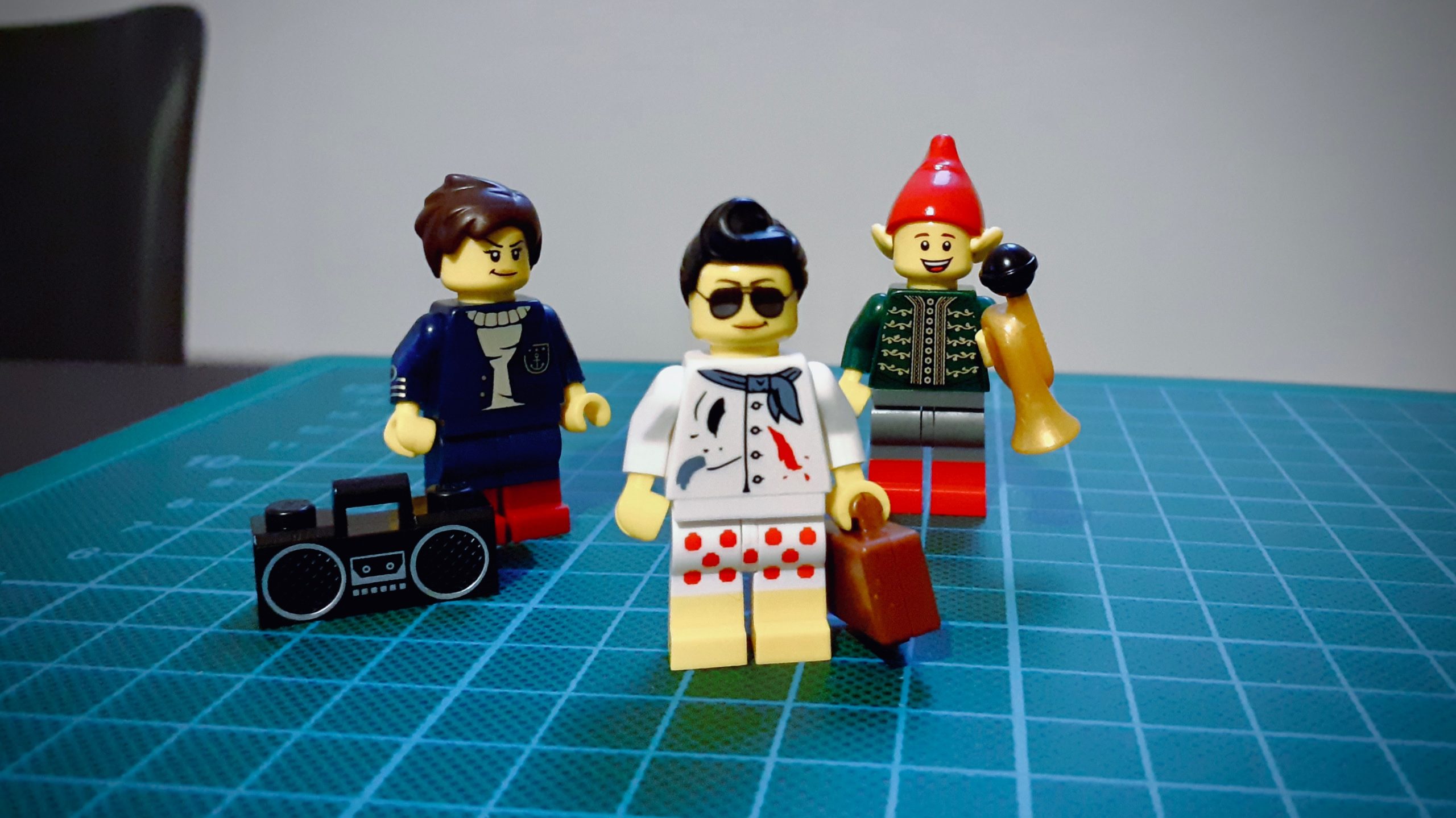
    Last week I went to a LEGO Store for the first time in Cologne, Germany, and they are amazing! They have these kiosks on each corner of the store with thousands of little pieces that you can use to create your own Minifigure set.

    These are the three minifigs Fernanda and I made:

    Lego Minifigures

    How cool are they? 😀

  • Animating a UI with Origami Studio

    To kick things off in my new creative process series, I decided to revisit an old project I did back in 2017 and make a small animation using the Origami Studio app.

    This app allows the creation of highly interactive prototypes using a visual programming language. The prototypes can also be recorded, which is useful to share with colleagues and stakeholders. As you can see, the animations add an interesting level of fluidity to the user interface.

    In the future, I plan to share more about how I make these animations, some mistakes, insights, and other exciting stuff I learn along the way.

  • End of hiatus

    End of hiatus

    I’ve meaning to write this for a while now. 2 months, 18 days to be more precise. It’s been a long, long time since I posted on the blog, to be honest.

    Much has happened in between, but I will spare you from the boring parts. The most recent, most exciting thing that happened is that I am now living in Germany with my wonderful, talented, amazing girlfriend and partner in crime adventures Fernanda.

    We moved at the end of July to Berlin and stayed there for a couple months while she was studying German. At the end of September, we moved again, now we are in Detmold, a cute little town in the Nordrhein-Westfalia state.

    As of now, Fernanda is attending to her master’s course in Computational Design at the TH-OWL (Technische Hochschule Ostwestfalen-Lippe), and I am actively, emphatically looking for a job.

    I am practically applying for every UI/UX Design position I find on LinkedIn, Xing, StepStone, Adzuna, Experteer… you name it.

    Last week, for example, I was in Düsseldorf for a job interview at a company headquarters. It was great and all to meet some of the team. I felt I’d done an excellent job presenting myself, talking about my previous experiences at Wine.com.br, Pixter, my design thought and process, and all these things you want to say to show you’re the ideal candidate.

    The thing is I didn’t make it this time, unfortunately. The feedback I received briefly noted my subpar workshop experience and lacking English skills. That’s true, I guess. These are things I will definitely work on my future applications.

    My beloved Fernanda is going to help me with some English practicing in the evenings, and I am continually improving my CV and Portfolio to really stand out from the competition and feel more confident during the interviews.

    Tomorrow a technician from O2 is finally coming to install the internet in our apartment. Hopefully, it will work smoothly because I’ve been connecting to a nearby T-Mobile hotspot, and it’s far from stable, to say the least.

    Piece by piece, our dachgeschoss apartment is getting more comfy and complete. We’ve already got some kitchenware from IKEA, a vacuum cleaner to keep the carpet clean, a smart LED lightbulb from LIFX to help us wake up in the morning, but we still need new furniture. Bed and mattress, working table, TV set, chairs, stool, sideboard, wardrobe, bathroom cabinet, mirror, additional light fixtures… and a lot more sigh. Lucky for us, we got awesome friends, one of which kindly lent us a larger air mattress to sleep on.

    Meanwhile… Autumn’s in full swing in Detmold, and I can’t wait for what’s coming in the next weeks!

    🎧 Now Playing: Sydney – It’s Worth the Drive to Action

  • 10 Books to Read in 2017 and Beyond

    April has come to an end, the temperatures are getting cooler and the year is already full on with things to do, see and learn but it’s also a good reminder that I still have many books to read.

    Earlier this year I’d planned, among other things, to read about ten books, that’s one every five weeks. Having read just one, it looks like I’m way behind schedule already.  Frankly this post itself was supposed to be published in January, but hey, at least it’s not a draft anymore. ¯\_(ツ)_/¯

    So, here it is, the 10 (or so) books I’m gonna read in 2017, in no particular order:

    The Magic Mountain – Thomas Mann

    This is probably the first book I downloaded to my Kindle Paperwhite e-reader. I actually got this a couple of years ago as a birthday gift from a friend but never really had the time and energy to read it. The book, a long and exhaustive read, a “brick” in softcover form, is regarded as a classic of German literature.

    The novel revolves around the life of Hans Castorp, a young man who visits his cousin in a sanatorium in the Swiss alps for a short time but ends up staying more than he has planned. The story explore the routine in the sanatorium while exploring the social life of it’s many inhabitants, including curious characters with whom the hero often engages in epic philosophical battles.

    After months of procrastination I finally finished it in March. Unfortunately, my experience wasn’t the best and I felt a bit underwhelmed with the ending.

    The Autobiography of Malcolm X – Malcolm X

    I’ve been heard about Malcolm’s life as a Black activist along the years but never really had the opportunity to know his story. I remember reading some rave recommendations of this particular book and I look forward to get to know his persona better and learn more about the impact he’d had in modern society.

    The Accidental Taxonomist – Heather Hedden

    Recently, I’ve had difficulties when dealing with categories creation, content organization in some ongoing projects at Porto Seguro Faz. I decided to dig deeper on the matter and look for more information about the topic and found this book which seems to contain some practical tips on creating and maintaining taxonomies, which will come in handy really soon!

    Why Only Us – Robert C. Berwick, Noam Chomsky

    This book come as a free exit for my curious mind. I think I’ve stumbled upon it after watching the movie Arrival and reading dozens of articles about language and evolution. Also, it’s written by the well-known linguist Noam Chomsky, whom I’ve been curious to read for quite some time now.

    Liquid Modernity – Zygmunt Bauman

    Bauman seems to be a reference when speaking about modern society and it looks like this book is the must read to understand the topic. I hope it will be as good as people say.

    Changer – Matt Gemmell

    Matt Gemmell is a guy I’ve followed on Twitter since he was an iOS developer. His first endeavor, Changer, is an action thriller that looks both exciting and promising involving a billionaire, top-secret projects set around cities in Europe. Also part of an ongoing series, it kinda reminds me of the also excellent Millennium trilogy.

    What the Dog Saw – Malcolm Gladwell

    This one came to me while browsing Amazon. It looks like a cool though-provoking book for curious minds. It seems to be made of a set of essays that explores “the mundane, the underdogs, the overlooked” – the kind of universe I’m constantly interested about.

    The Inmates Are Running the Asylum – Alan Cooper

    This book’s regarded as an interesting read that explores the presence of technology in today’s life. It has appeared in some “must read“ lists for design books and appears to have some good reviews about it. I hope it shows a provoking perspective for creating digital artifacts.

    The Brief Wondrous Life of Oscar Wao – Junot Diaz

    A book about a disastrously overweight nerdy boy who dreams of being the next J.R.R. Tolkien. The introduction looks absurdly crazy and I really have no idea what to expect from this title but knowing that the story might mix fantasy, science fiction just made me a lot more curious about it.

    The Art of Learning – Josh Waitzkin

    To finish this list, a book about learning – yes, a motivational book. Waitzkin tells his story as a chess player and championship winner. Looks promising, though-provoking and may teach me some things along the way.

    More books to come

    There are even more books to read after I finish this list, woot! I guess I should stop writing and go read some, right? Okay, for now I’ll leave five more titles that already are on my wish list. Perhaps you’re getting me one? 😀

    Whatcha readin’?

    Ping me on Twitter and let me know!

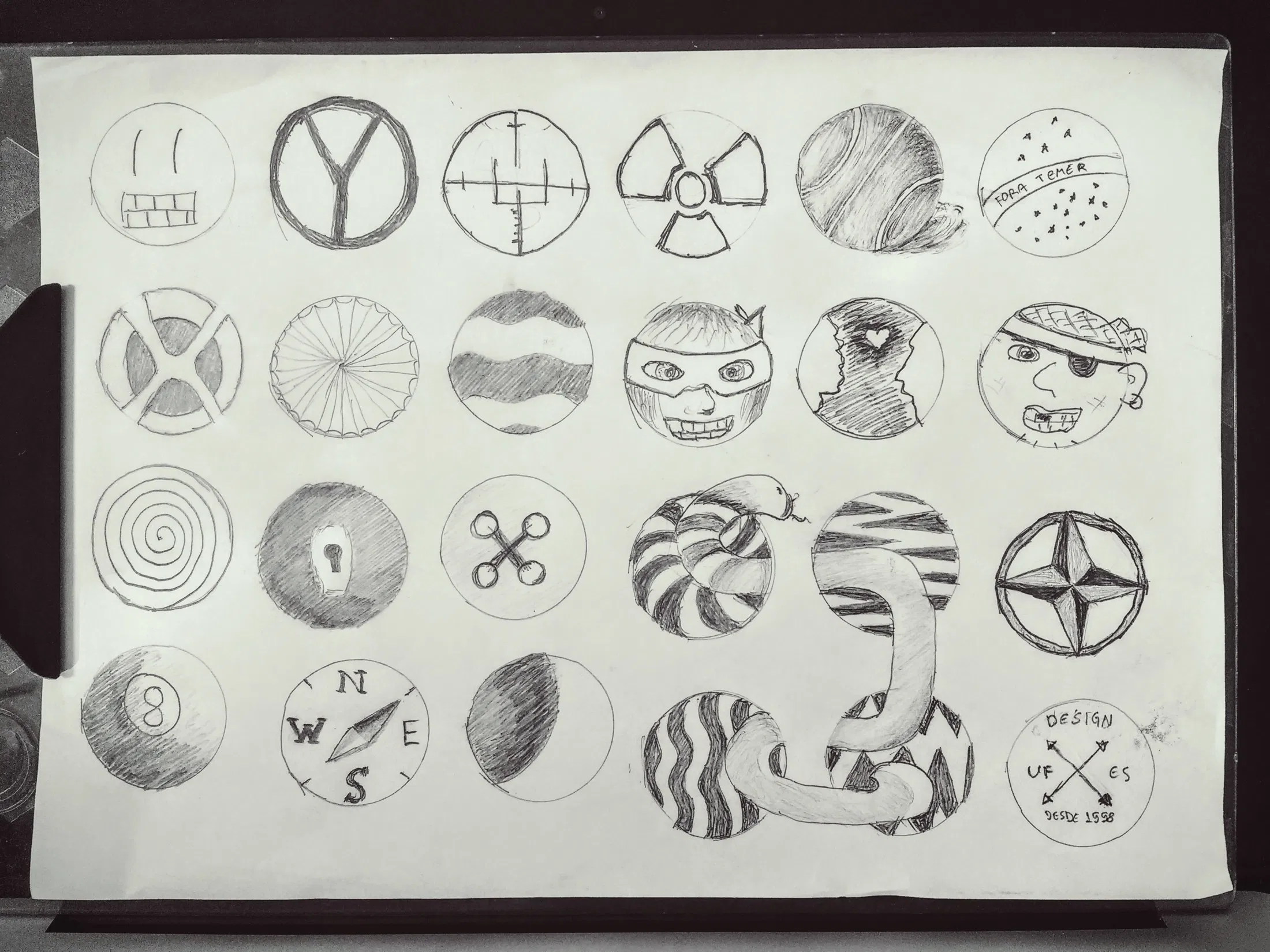
  • Brainstorm Exercise, Drawing Inside Circles

    Brainstorm Exercise, Drawing Inside Circles

    Circles can be the constraint, the frame or part of the illustration itself.

    Coming with a good idea is hard.

    Coming with several, perhaps dozens, of ideas sounds harder still, but one of the takeaways from this Ideation course I’m enrolled to is that you’ve to let go of judgment and just jot them down, and to sketch away any ideas that comes into your mind.

    Admittedly, I’ve spent more time in this exercise that I’ve planned but the process was insightful nevertheless.

  • Storyboarding Design Ideas

    In today’s post I’ll share the result of the second assignment for the HCI specialization course I’m enrolled with this trimester.

    From the assignment instructions:

    A storyboard presents a scenario that takes a hypothetical user from setting (a problem, need, or desire embedded in a specific situation) to satisfaction (an outcome achieved through a design that addresses the problem/need/desire). Storyboards show what a design enables the user to accomplish without specifying a particular user interface. A good storyboard begins by introducing the problem: what does the user seek to do? The subsequent panels walk through what the user does. It introduces how the user begins using the system, any exploration that they do, and how the design helps the user accomplish their goal.

    For these storyboards I’ve drawn inspiration from an interview with my colleague Paula Maria and other community needs I’ve been observing for some time.

    Light Deliveries

    The first design, Light Deliveries is about an app to facilitate the hauling of small to medium cargo. Increasingly people in Brazil are losing jobs with plenty of vacant small trucks to be used. A person will be able to input the cargo information, origin and destination. Afterwards, drivers would accept or decline the offer.

    As a variation of this idea, an elderly lady using the same app could buy cat food from a local pet shop and an available driver would deliver the goods to her place.

    Routes

    The second idea’s an effort to help people getting around with public transportation. A person can check in to a desired bus route and see all of the information about its trajectory, e.g. landmarks, street names, neighborhoods, street-level imagery, alerts, maps, etc.

    In the second example, two friends use the app to meet on the same bus, bringing more safety to their trip.

    This system could be specially useful for tourists, sporadic commuters and people with visual impairment.

    Shower Center

    Finally, based on some evidence found in the answers from the interview, I introduce a shower center, or shower facility, so bike commuters have a place to freshen up and clean before and after work. This is particularly welcome because the majority of company offices in Brazil don’t offer suitable facilities of this kind for their employees.

    The same can be used after work or at any time, really.

  • Email Background Images with CSS

    There’s a deeply rooted misunderstanding among e-mail marketing folks that background images don’t work in e-mails and, therefore, can’t be used to illustrate or beautiful creations.

    In fact, if we inspect today’s available HTML and CSS attributes in major e-mail clients and providers, we’d think we’ve taken a lift with Marty McFly and brought back to the remote year of 2001 in which websites were built using just tables and sliced images.

    I don’t wanna point fingers but there’s a certain company which brags itself about pushing the web forward that still has an email client which don’t support media queries in the year 2015. Yes, big G, I’m talking to you. *wink wink*

    Nevertheless, we’ve got the web on our side and it shows us that there’s a way for everything, even if it’s not a fancy one.

    Limitations with email background images

    We need to know that there’s some gotchas when to work with images in emails with no surprises.

    First of all, the background image have to be set in a particular <table> or <td> element. Then you need to pick an image which primary content is in the upper left area of the picture.

    The reason why is that you cannot change the background position using the CSS property like we’re used to do in the web. Email clients just don’t like that. Period. Few ones do have better support but in general images will always be aligned to its upper left corner — live with that, okay?

    Moving on, the background will repeat both in the x and y-axis. Yep, you can’t change that too. So, it’s a good idea to if the table cell — or table — have the exact same width and height of the image if you don’t want it to be cropped our inadvertently repeated.

    Now take a deep breath and let this stuff sink into your brain.

    Okay, going forward, we got another thing to decide, which email clients are we targeting? If your answer is “every one but Outlook and Windows Mail” then your life had just become 500% more simple, chap, ‘cuz the majority of the providers out there supports standard HTML attributes. High five!

    In your email code, set the background and bgcolor attributes of the table cell to the image’s URL and a fallback color, respectively.

    <table border="0" cellpadding="0" cellspacing="0" width="640">
      <tr>
        <td align="center" bgcolor="#bada55" background="path/to/file.jpg"
          style="background-color: #bada55; background-image: url(path/to/file.jpg);">
    
          <!– content goes here –>
    
        </td>
      </tr>
    </table>

    Important, note that in this example there’s the presence of the style attribute in which the values are also declared. This is for compatibility’s sake, mostly.

    While some clients support the former declaration others support the latter. Campaign Monitor have a great page which lists in detail all the properties supported by every major email vendor.

    Now you see… now you don’t

    You might have asking yourself “how I deliver the same design for people who use arcane clients like Outlook, Windows Live Mail or, in reality, any of Microsoft’s software?”

    The secret sauce: conditional comments and VML markup. Don’t know what a VML is? Yep, me neither.

    “hey, if ur Outlook ’07 or newers pls read this code here otherwise just ignore it, kthxbye”

    A conditional comment, as the name implies, is a special HTML comment created by Microsoft which let developers target some chunk of HTML to a given version of one of their apps, rendering engines, etc.

    On the other hand VML is a XML-based format also developed by Microsoft for creating graphics in two dimensions. It was supposed to be what the SVG is today.

    Both technologies are obsolete and aren’t available today in the most recent versions of Internet Explorer though they’re useful for us in this scenario.

    <table border="0" cellpadding="0" cellspacing="0" width="640">
      <tr>
        <td align="center" bgcolor="#bada55" background="path/to/file.jpg"
          style="background-color: #bada55; background-image: url(path/to/file.jpg);">
          <!–[if gte mso 9]>
            <v:rect xmlns:v="urn:schemas-microsoft-com:vml" fill="true"
              stroke="false" style="width: 640px; height: 400px;">
            <v:fill type="tile" src="path/to/file.jpg" color="#bada55" />
            <v:textbox style="mso-fit-shape-to-text:true" inset="0,0,0,0">
          <![endif]–>
    
          <!– content goes here –>
    
          <!–[if gte mso 9]>
            </v:textbox>
            </v:rect>
          <![endif]–>
        </td>
      </tr>
    </table>

    Take a look, in line 4 we’ve got the [if gte mso 9] tag which tells us the code contained through the [endif] will be rendered if the condition inside the brackets is evaluated true.

    Now, what the hell does gte mso 9 even mean? Chill up, I’ve got you:

    • gte is short for greater than or equal
    • mso stands for Microsoft Outlook
    • and finally 9 is the internal code for Outlook ’07

    Basically we’re telling the programme “hey, if ur Outlook ’07 or newers pls read this code here otherwise just ignore it, kthxbye”

    Finally, we got to the code that really displays the background image. The important here is to tweak the srccolor and style attributes to match the required values.

    Once again we owe to the Campaign Monitor folks who have an amazing, bullet-proof background image generator for us to make use of. Guaranteed.

    Results

    After more than four dozen tests, corrections here it is, a sparkling wine bottle featured with the Eiffel tower in the background shown on Outlook ’13.

    To the curious I suggest peeking in the source code for the example above.